01
Product
Form, comfort & feeling
Furniture, products & packaging Industrial design from insight through production intent—sculptural furniture, inclusive products and beauty packaging.
Explore product design →Multidisciplinary Designer / Toronto
I make ideas tangible, and help teams move through complexity with clarity.
Designing thoughtful products, spaces and experiences through research, strategy and making.
Form, comfort & feeling
Furniture, products & packaging Industrial design from insight through production intent—sculptural furniture, inclusive products and beauty packaging.
Explore product design →
Making sense of what comes NEXT.
Strategy & research Research, systems thinking and scenario work that turns complexity into useful choices and future-facing roadmaps.
Strategy & foresight →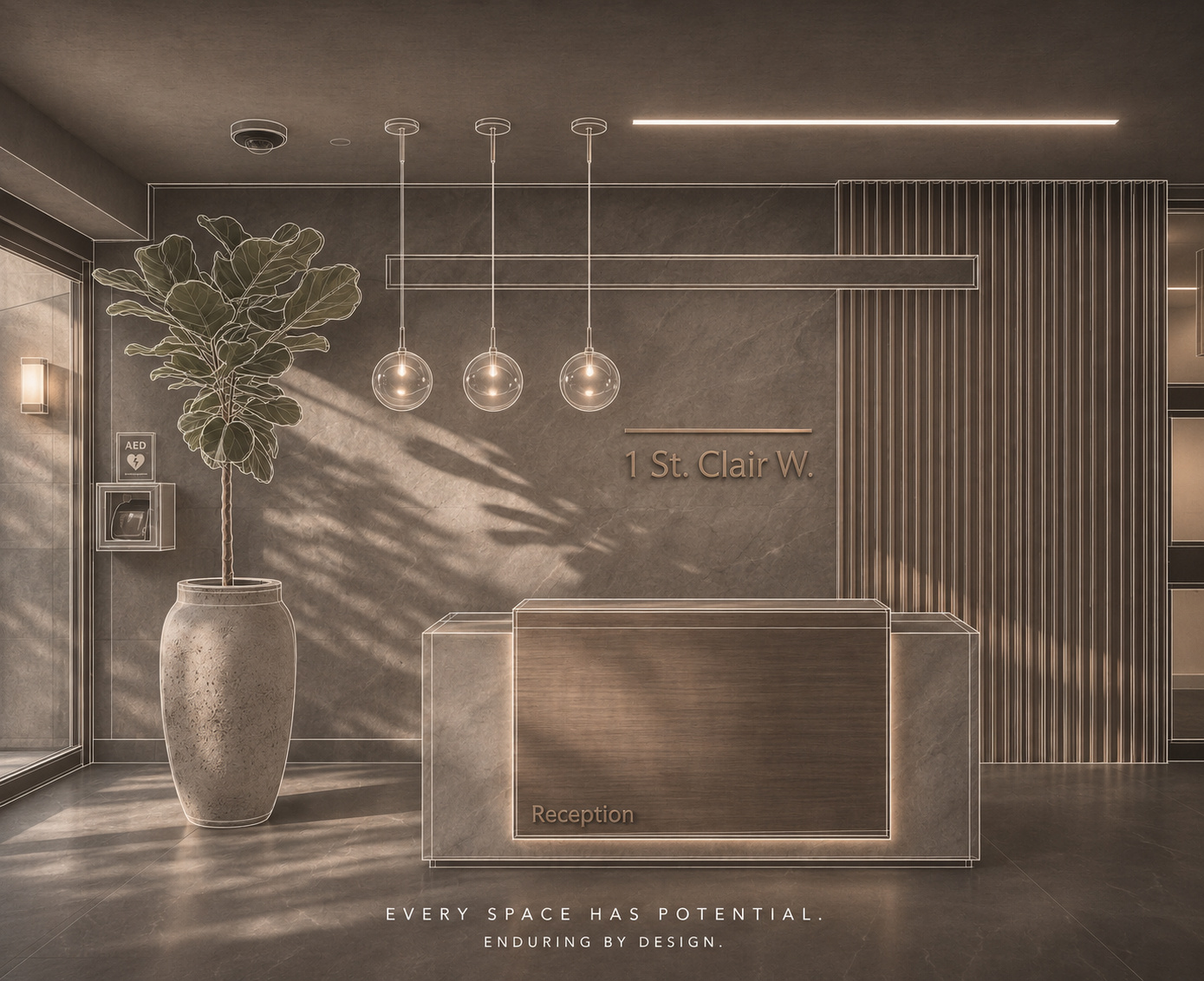
Homes with heart Spaces with strategy
Interiors & staging Interior styling for commercial, hospitality and residential environments, from concept through final placement.
Designed spaces →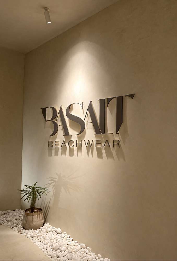
Logos, systems & stories
Identity & graphic design Logos, websites and graphic systems that carry one clear point of view through every customer-facing detail.
Explore branding →I move from research and framing into form, material, experience and delivery. Each case study makes my role, process and contribution visible—not only the finished image.
Process
Understand the people, context and ambition behind the brief.
Turn research and constraints into a focused design opportunity.
Explore form, material, story and experience through tangible options.
Test the strongest direction and carry it through the final details.
At a glance
Multidisciplinary designer · Toronto
Homes with heart, spaces with strategy — interiors styled for commercial arrival, hospitality stays and homes ready to sell.
THE APPROACH / DESIGN THINKING
A visual guide to the considerations that shape the spaces in this portfolio.
Understand the space, audience and intended experience.
Establish a coherent spatial and material concept.
Refine layout, finishes, furniture and visual language.
Communicate the proposed experience through visualizations.
This framework describes the portfolio approach; project-specific work is presented in the galleries below.
Commercial Spaces
My roleStyled two downtown Toronto building lobbies
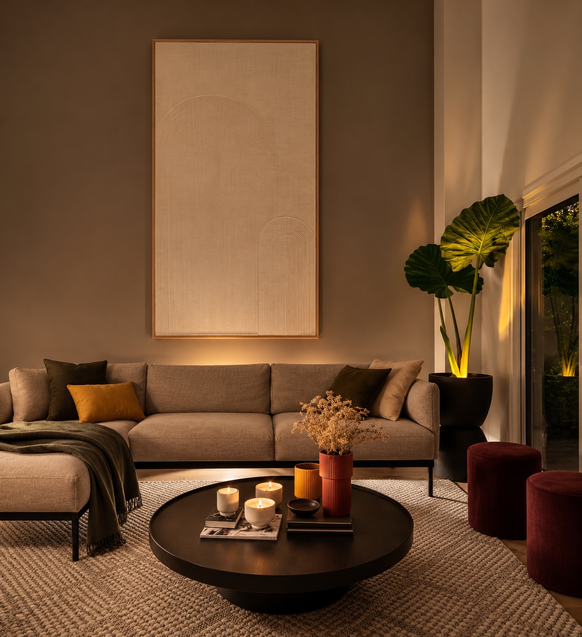
I styled two downtown Toronto building lobbies to transform the first impression of each property. Furniture, material finishes and lighting were considered as one experience—welcoming tenants and visitors while giving the buildings a more distinctive, leasing-ready presence.
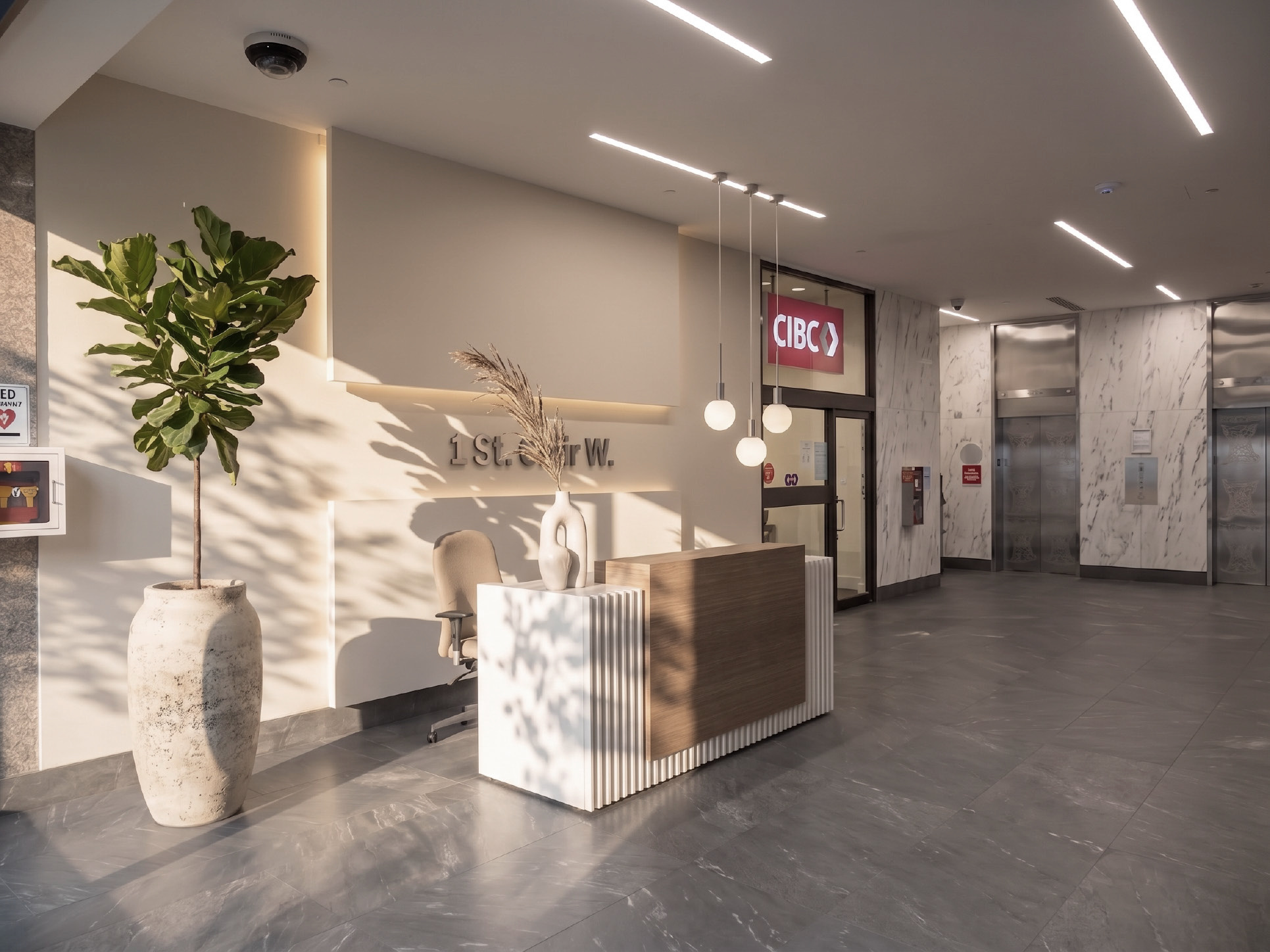
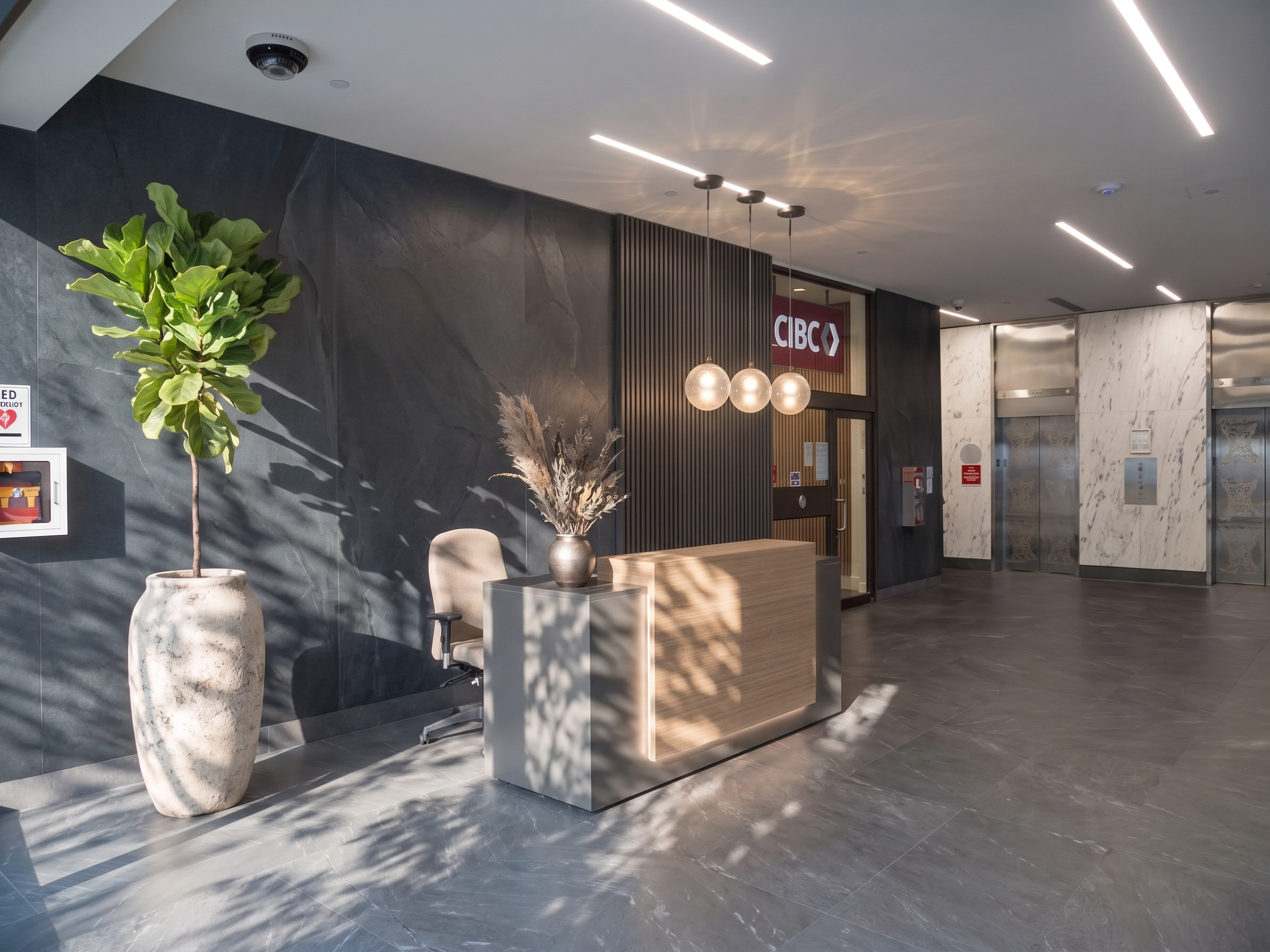
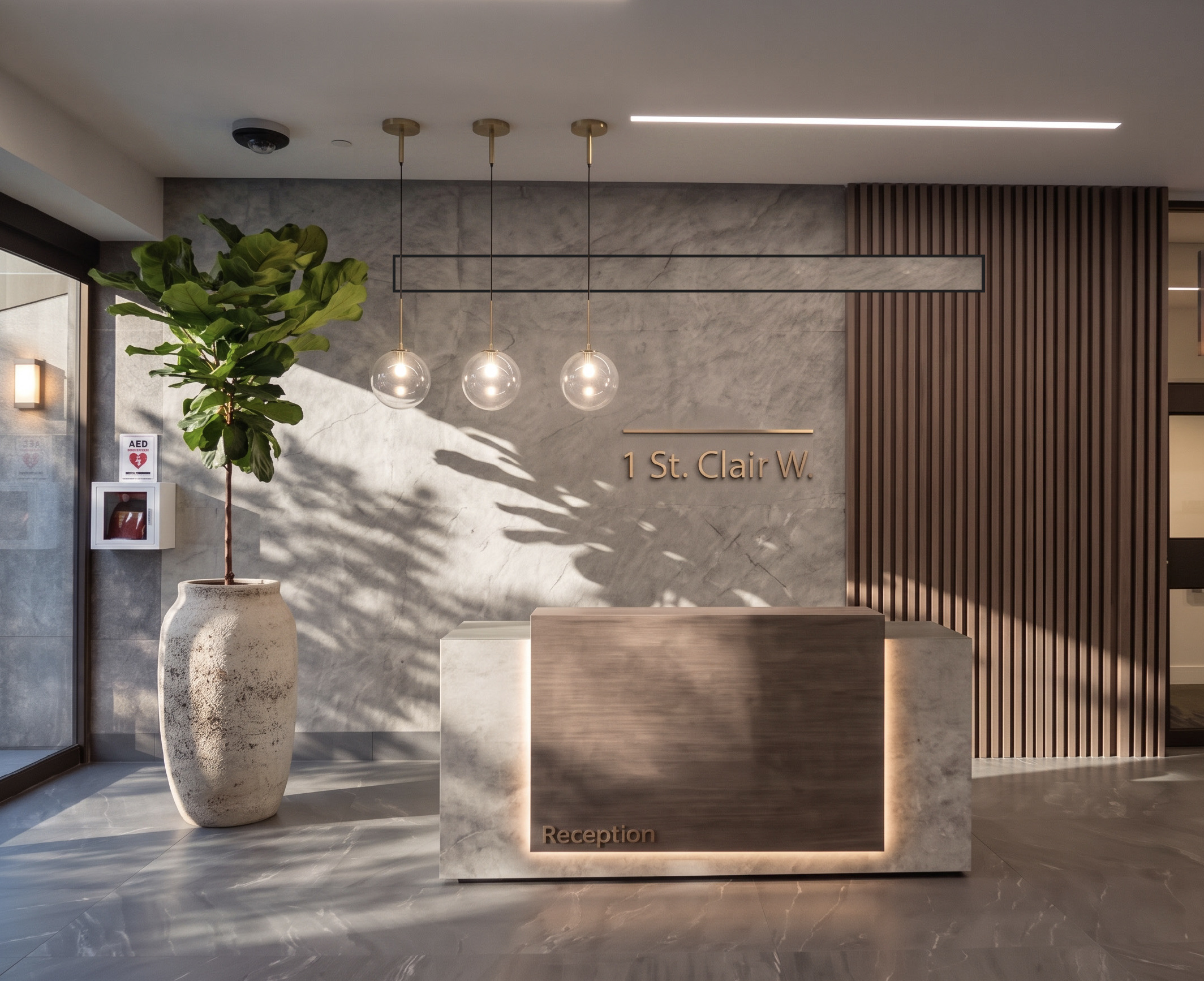
The process started by reading each arrival: how people enter, what they notice first and where furniture, light and material could create a clearer welcome. That on-site perspective set priorities for a focused styling concept.
A tailored concept brought warmth and identity to the high-use spaces without losing their professional clarity. Tonal finishes, sculptural lighting and considered furnishings helped the lobbies feel elevated, memorable and easy to move through.
Furniture, finish and lighting selections were coordinated, then refined through final styling. The result strengthens the everyday tenant and visitor experience while helping each building present itself with the polish expected in a competitive leasing market.
Hospitality
My roleStyled the interiors of eight rental units
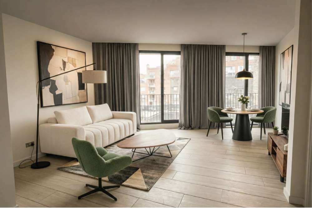
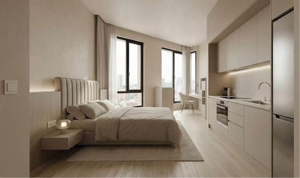
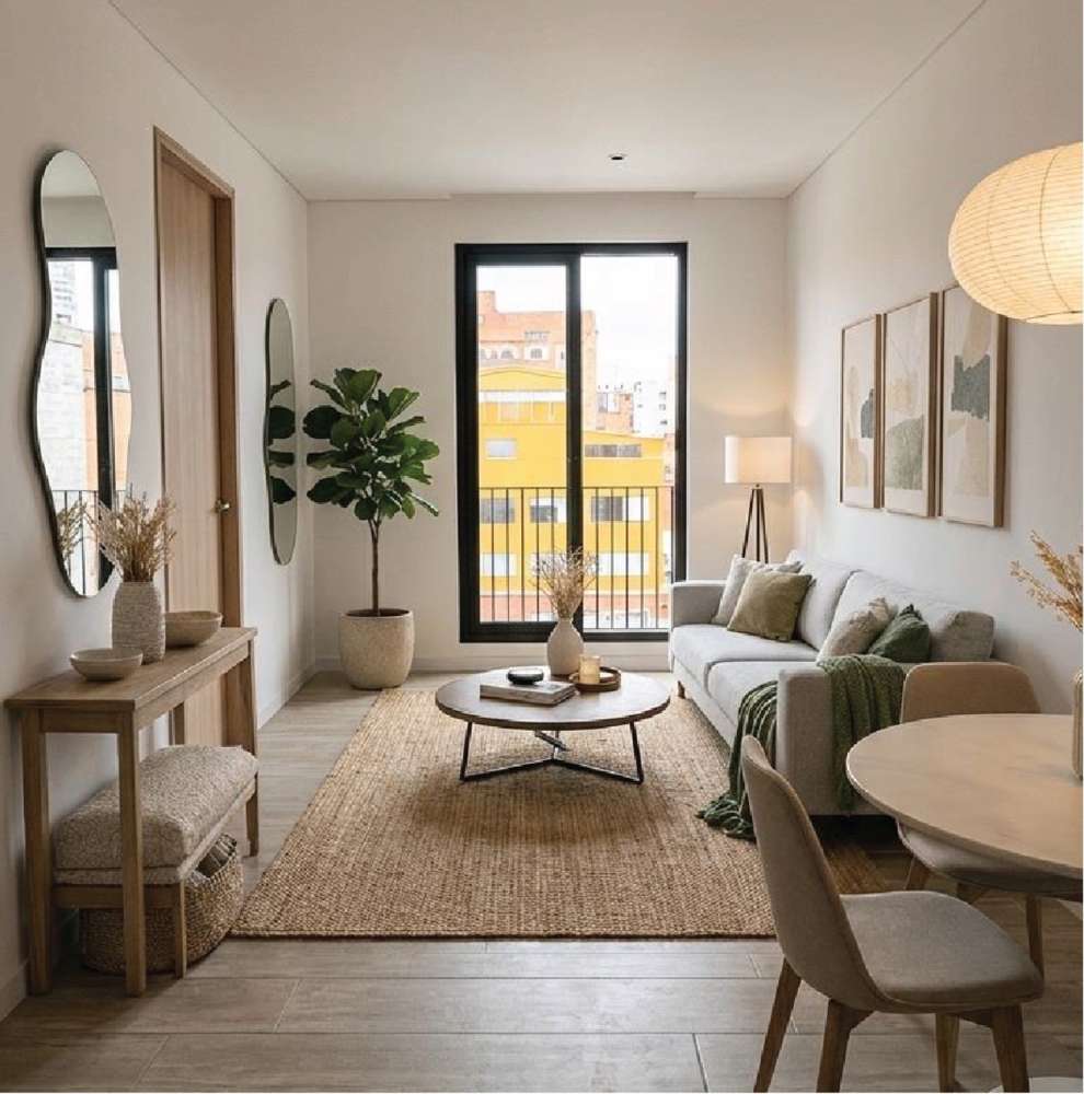
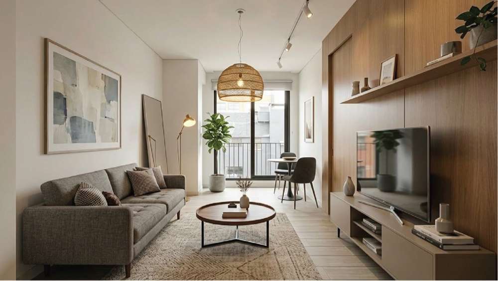
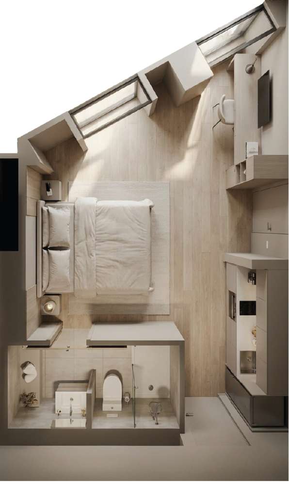
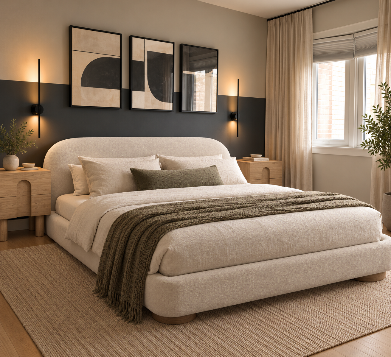
I styled the interiors of eight rental units in Nuvana Living’s hotel-like Airbnb building. A cohesive warm-minimal direction connects the collection, while variations in art, colour, furniture and lighting give each unit its own character.
White upholstered sofas, green accent chairs, curated art and sculptural floor lamps create inviting living rooms, with dining nooks that make compact plans work harder. Serene bedrooms pair upholstered beds and soft neutral linens with generous daylight, while sleek handleless kitchens keep the backdrop clean. The palette is photogenic yet practical, designed for durability and an effortless guest experience.
Drag or scroll sideways →
Staging
My roleStaged two Toronto apartments for sale
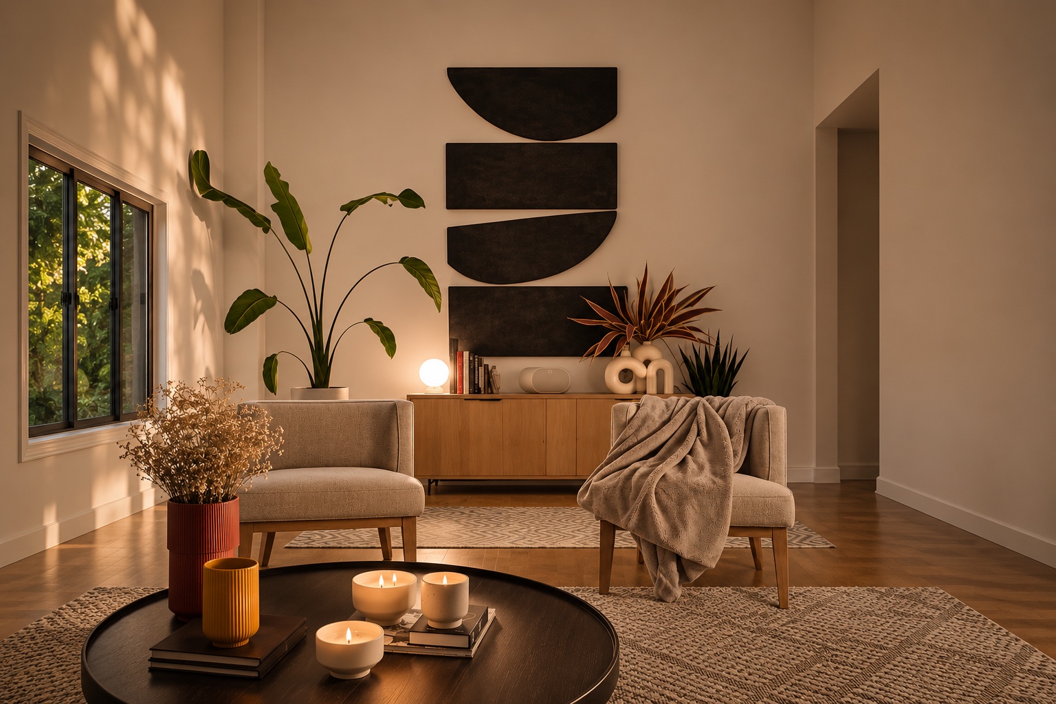
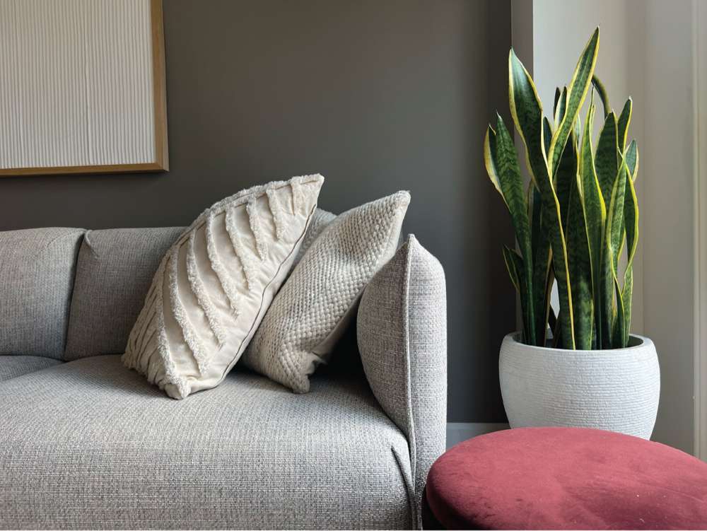
Two Toronto apartments were staged for sale with a clear goal: help potential buyers emotionally connect with the space from the listing photography through the in-person showing.
By removing visual distractions and introducing furniture, lighting and finishing details with intention, each apartment could communicate its scale, flow and everyday possibilities more clearly—positioning the units to sell without overwhelming the architecture.
Multidisciplinary designer · Toronto
Retail displays, furniture, products & packaging: objects shaped by insight, ergonomics and material honesty, from first sketch to production intent.
THE APPROACH / DESIGN THINKING
From design intent to form, detail and production thinking.
Clarify people, needs and constraints.
Generate directions and test visual possibilities.
Develop form, ergonomics, materials and details.
Present a clear, buildable design intent.
Stages are a navigation framework; see individual projects for documented activities.
In-store displays for beauty brands at Sephora, Ulta & Montréal Airport
See the retail displays →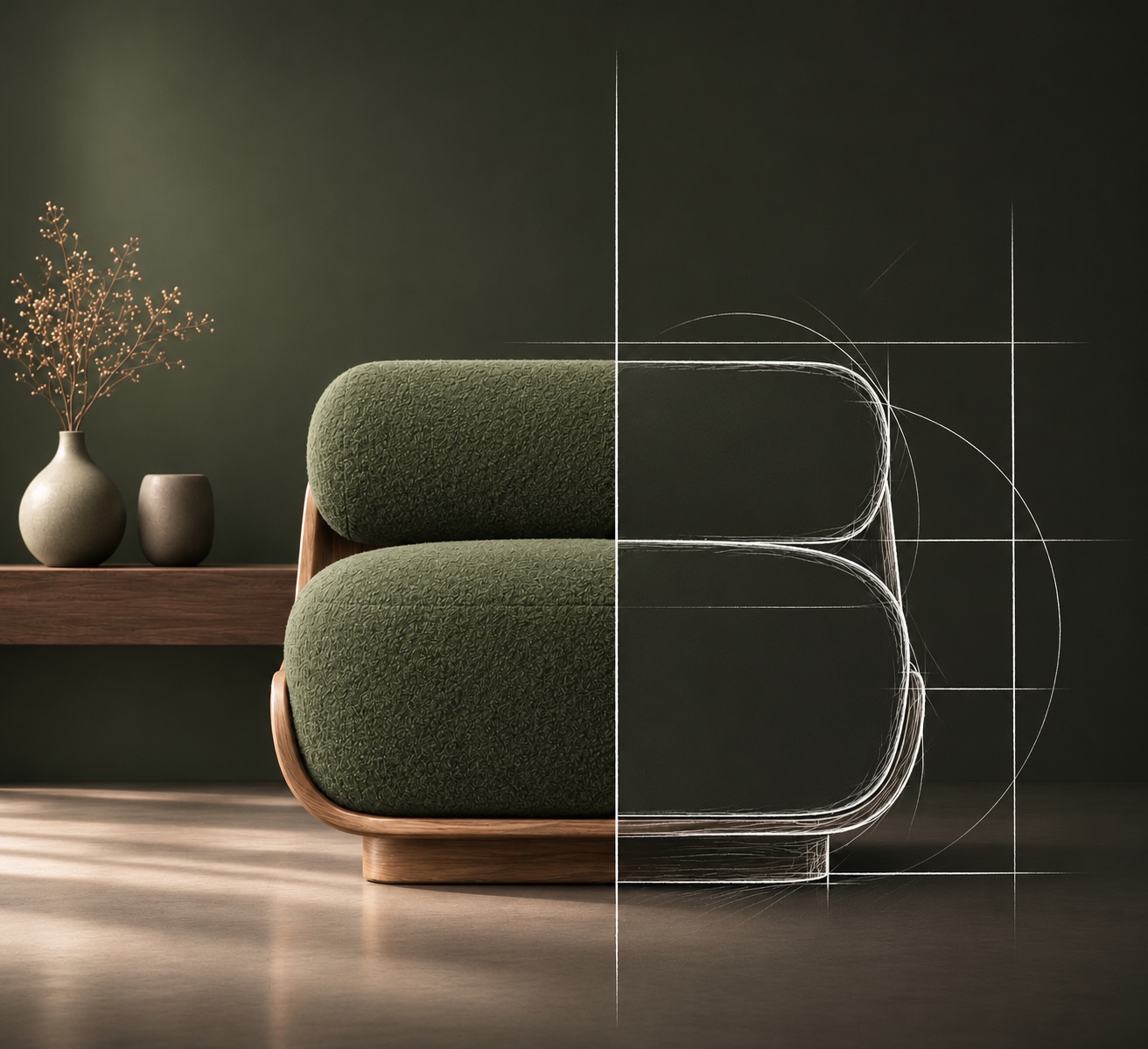
Nido, Acento, Luna & the Kvell line
See the furniture projects →
Fascina & the Belcorp beauty lineup
See the cosmetics projects →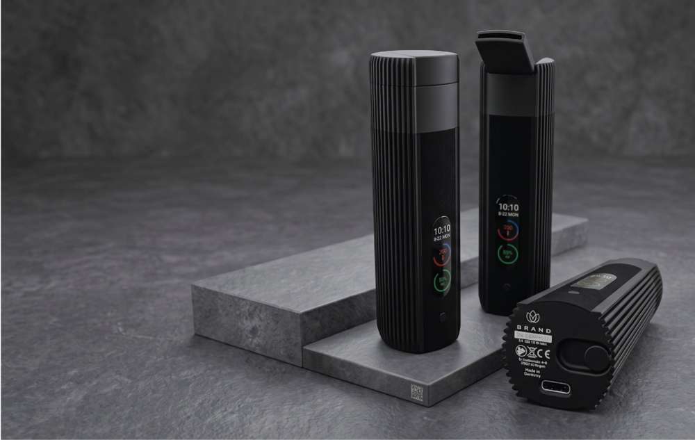
Vaporizers & X-Matik LaneCruise
See the technology projects →Multidisciplinary designer · Toronto
Product · FurnitureEvery furniture project on one page: the Nido and Acento chairs, the Luna day sofa, and the Kvell pieces shown as their own projects, Kids Furniture, Hampers, Benches and Headboard. Open any project with its + to unfold more images and the full project story.
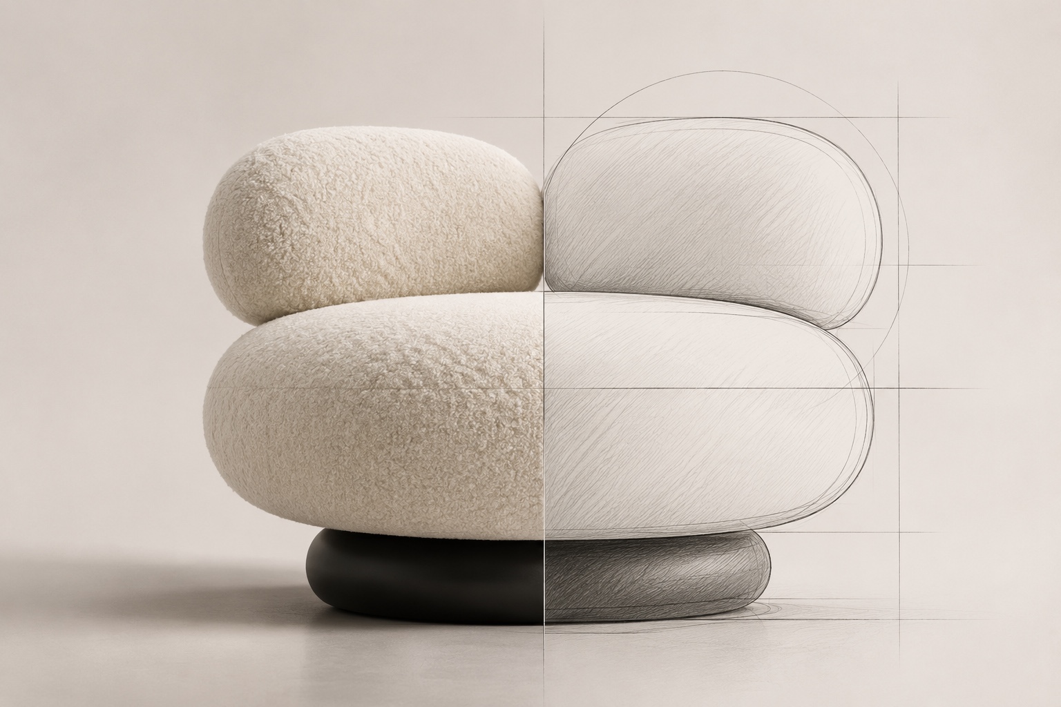
Soft pebbles, composed into a chair.
My roleForm and proportion studies, 3D modelling and rendering
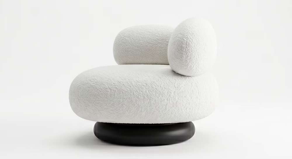
Nido is a lounge chair composed from three pebble-like volumes: a deep, rounded seat and two oval back cushions, all wrapped in white bouclé and carried on a single matte black plinth base. I developed the chair through form and proportion studies, 3D modelling and rendering, resolving the cushion volumes, the bouclé upholstery and the base so the construction stays hidden and the chair reads as pure soft form from every angle.

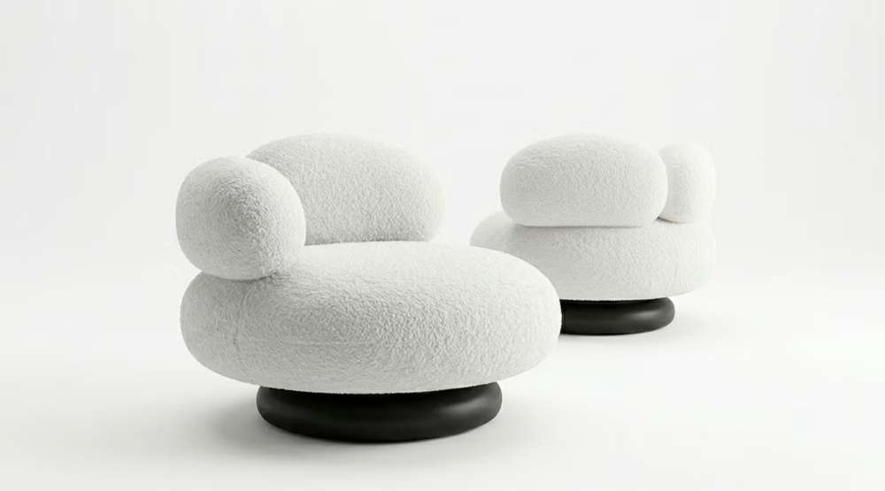
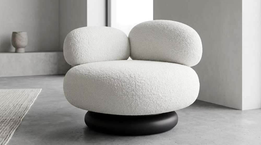
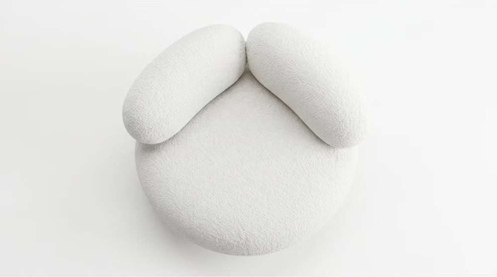
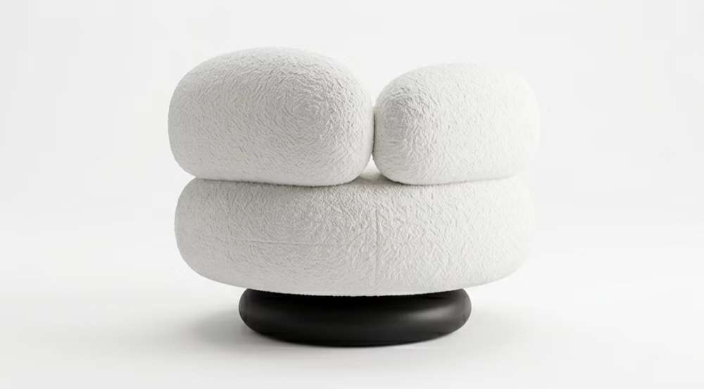
From the front, the two oval back cushions meet above the deep seat like a pair of resting pebbles. Nothing interrupts the softness: no visible legs, no exposed frame, just bouclé volumes on the black plinth.
Pebble volumes · White bouclé · Plinth baseIn profile the composition stays legible: one back cushion turns toward the sitter while the seat swells forward, and the recessed plinth lets the upholstered body float just above the floor.
Profile study · Proportion · Floating baseShown as a pair, the chairs hold a room the way smooth stones hold a stream bank: calm, rounded and quietly sculptural, each one turned slightly toward the other.
Paired seating · Sculptural presenceIn a minimal grey room the white bouclé reads almost architectural, its soft volumes set against concrete and plaster. The chair was designed for exactly this balance: comfort that behaves like sculpture.
Lifestyle presentation · Interior stylingSeen from overhead, the plan of the chair is a soft triangle: two back cushions angled over the round seat, so the sitter is held from both sides.
The back view keeps the same pebble language, the two cushions reading as smooth stones stacked on the seat, finished to be seen in the round.
Give a lounge chair the softness of stacked pebbles without losing support or a clear silhouette.
I developed the rounded volumes through form and proportion studies and 3D modelling, tuning the seat depth, the cushion proportions and the plinth base, then resolved the bouclé upholstery and its seams.
Keep the construction hidden: three upholstered volumes on a single matte black plinth, so the chair reads as pure soft form.
A sculptural lounge chair in white bouclé, composed and calm from every angle: front, side, back and above.
ReflectionThis case shows how far proportion and upholstery alone can carry a chair’s character.

Soft volume, held by a wooden sweep.
My roleSilhouette studies, ergonomic refinement, material comparison, 3D modelling and rendering
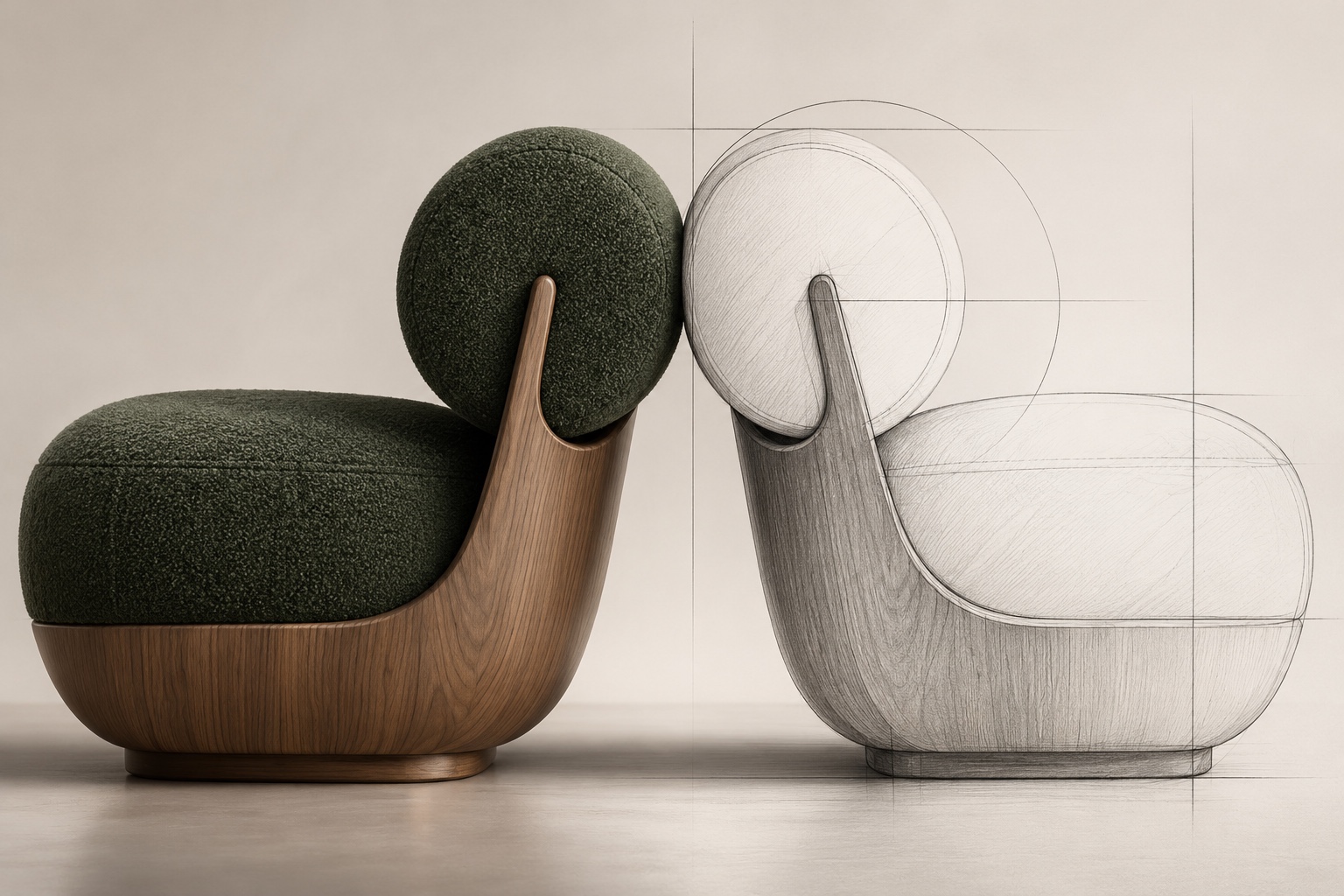
Acento pairs generous bouclé upholstery with a curved walnut shell, and the one design carries across colourways, from rust bouclé to forest green and oatmeal. The design was developed through silhouette studies, ergonomic refinement, material comparison, 3D modelling and rendering.

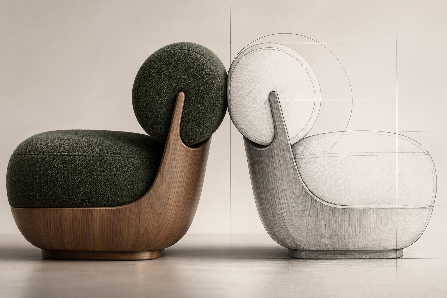
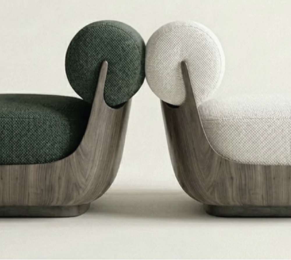
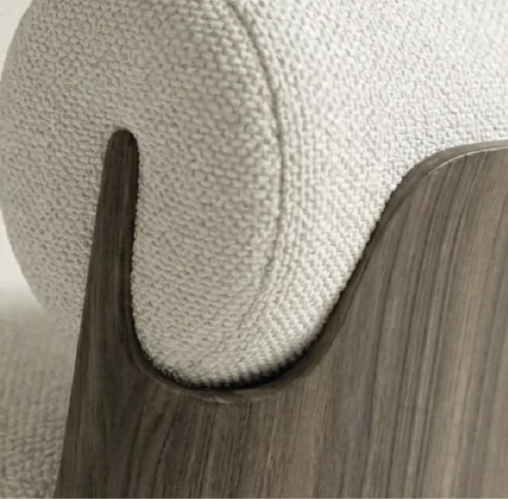
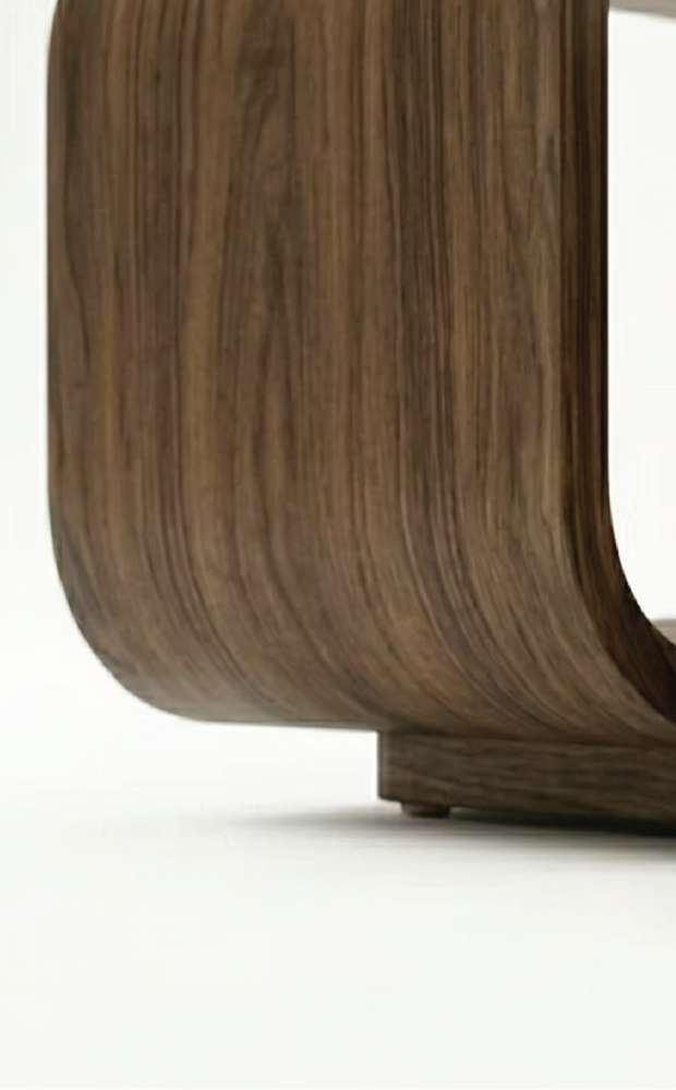
The forest-green bouclé chair is composed as two distinct gestures: a low, rounded cushion for comfort and an exposed walnut shell that cradles the body. The contrast makes both materials legible and gives the compact chair a confident silhouette.
Silhouette studies · Ergonomic refinement · Material comparisonSeen from the side, the shell flows from the low back toward the base as one continuous line. Modelling and rendering were used to refine that curve and the balance between the grounded base and the buoyant upholstered seat.
3D modelling · Rendering · Proportion studiesThe same Acento design in forest green and oatmeal, where structure and softness stay equally visible. The curved plywood body encloses the multi-density foam seat without feeling heavy, while the swivel pedestal lets the sitter turn between conversation, room and view.
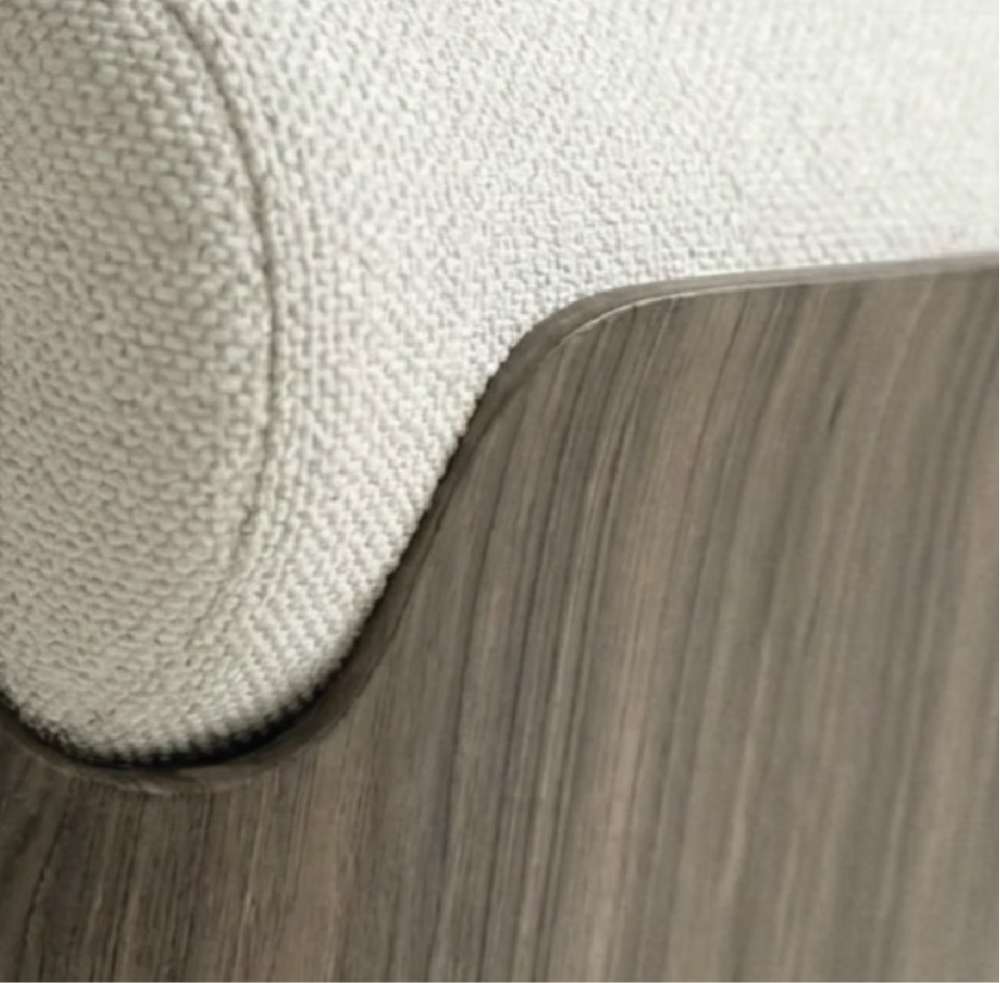
CNC plywood · Multi-density foam · 360° swivel · ColourwaysA narrow reveal keeps the upholstery visually separate from the timber and protects the clarity of each material at the chair’s most important junction.
Dense looped bouclé softens the touch points; smooth walnut brings durability and visual warmth. The detail study helped tune their scale and edge treatment.
The close-up shows how the upholstered volume is tucked into the curved plywood frame, keeping the edge precise while preserving the chair’s sense of shelter.
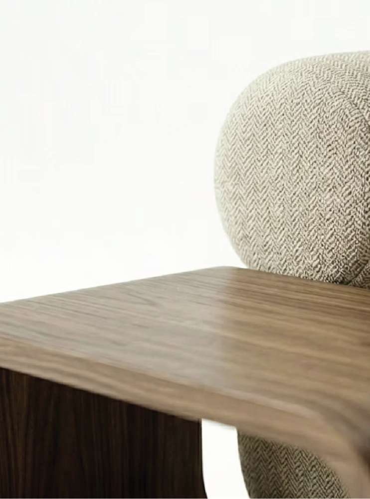
The laminated curve carries the enclosing line through the base. Refining its radius and exposed grain helped the construction read as intentional, warm and continuous.
Give a compact lounge chair a distinctive silhouette without compromising comfort.
I moved from silhouette and proportion studies into ergonomic refinement, material comparison, 3D modelling, rendering and detail development.
Separate the soft bouclé volume from the exposed walnut sweep so both materials remain legible.
A sculptural chair refined through ergonomic, proportion and material studies.
ReflectionThis case demonstrates how close detail decisions can carry an entire product identity.
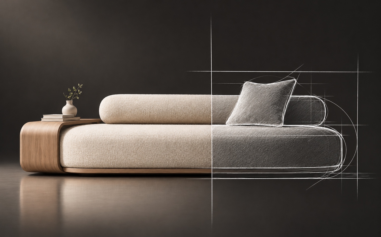
Lounge, gather and keep essentials close.
My roleProduct architecture, integrated timber surface and concealed storage
A sculptural daybed that brings lounging, conversation, an integrated timber surface and useful storage into one continuous composition.

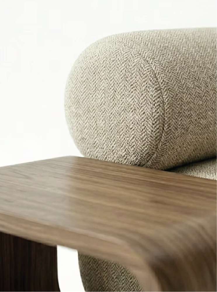
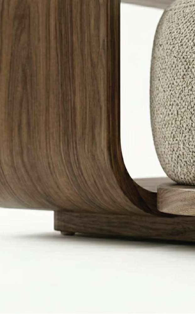
The low cream bouclé form supports relaxed sitting from more than one direction, making the day sofa useful for both conversation and pause. An integrated timber surface and concealed storage add function without interrupting the calm, rounded silhouette.
Multi-directional lounging · Integrated surface · Concealed storageThe walnut plane is built into the composition rather than attached as a separate side table, keeping the piece visually continuous and everyday objects close at hand.
The rounded timber base turns hidden capacity into part of the structure. Its softened edge supports the day sofa’s continuous, furniture-as-landscape character.
Combine lounging, conversation, surface and storage in one continuous composition.
I resolved the product architecture around multi-directional use, then integrated the timber surface and concealed storage into the rounded upholstered form.
Integrate the timber plane and concealed capacity into the silhouette rather than attach separate elements.
A multi-directional day sofa that brings several everyday functions into one calm form.
ReflectionThis case shows how I use product architecture to simplify a complex brief.
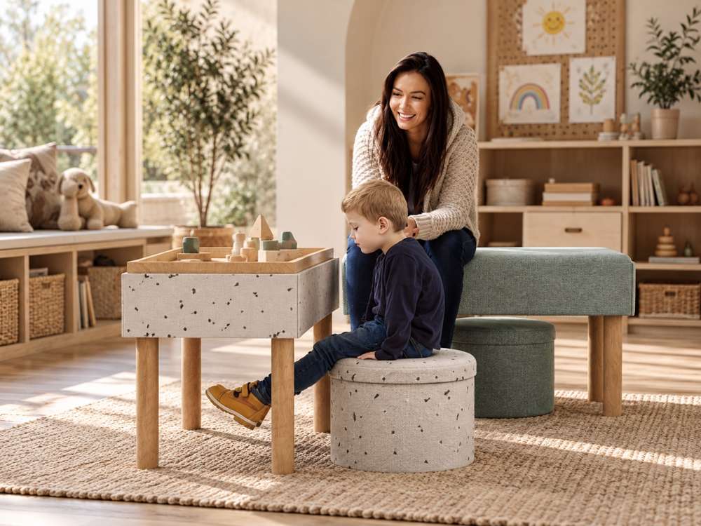
The Kvell line, at child scale.
My roleLed colour direction, art direction and trade-show booth styling; supported sourcing, specifications, manufacturing direction and quality control
Part of the Kvell collection. Kvell means “to feel happy and proud,” and its storage thinking extends to the playroom: furniture sized for children, with rounded forms and washable, hard-wearing finishes, so toys can be cleared into the furniture itself at the end of the day.
For the Kvell collection I led colour direction, art direction and trade-show booth styling, and supported sourcing, specifications, manufacturing direction and quality control.

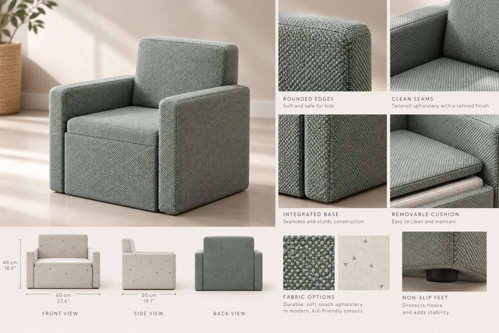
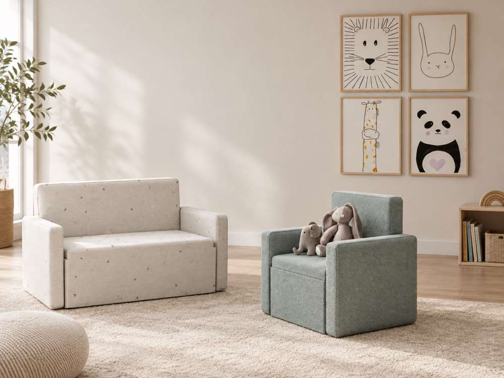
The storage thinking extends to the playroom: a tray table, stools, a bench and a round storage ottoman sized for children, so toys can be cleared into the furniture itself at the end of the day. Rounded forms and washable, hard-wearing finishes keep the set forgiving of daily use.
Child-scale ergonomics · Toy storage · Rounded formsEvery detail of the kids’ armchair answers a safety or care question: rounded edges, clean seams, an integrated base, a removable cushion for washing and non-slip feet. At 60 × 48 × 50 cm it gives a child a real, proportioned seat of their own, offered across a range of fabric options.
Rounded edges · Removable cushion · Non-slip feet · 60 × 48 × 50 cmThe loveseat and armchair bring the collection’s upholstered language into the children’s room without turning it into a toy: low, stable proportions, soft volumes and the same attention to seams and fabric as the adult line. Styled here as a reading corner, the use the pieces were designed around.
Child-scale seating · Upholstery · Styled presentationBring the Kvell storage idea into the children’s room at a scale and softness that suits small bodies.
I applied the collection’s research, colour direction and specification work to child-scale forms, resolving rounded edges, clean seams, an integrated base, a removable cushion and non-slip feet.
Keep grown-up upholstered forms, honestly resized, rather than turning the pieces into toys.
A playroom set, armchair and loveseat that store toys and give a child a real, proportioned seat of their own.
ReflectionThis project shows how I adapt one product language across very different users.
Laundry storage that reads as furniture.
My roleLed colour direction, art direction and trade-show booth styling; supported sourcing, specifications, manufacturing direction and quality control
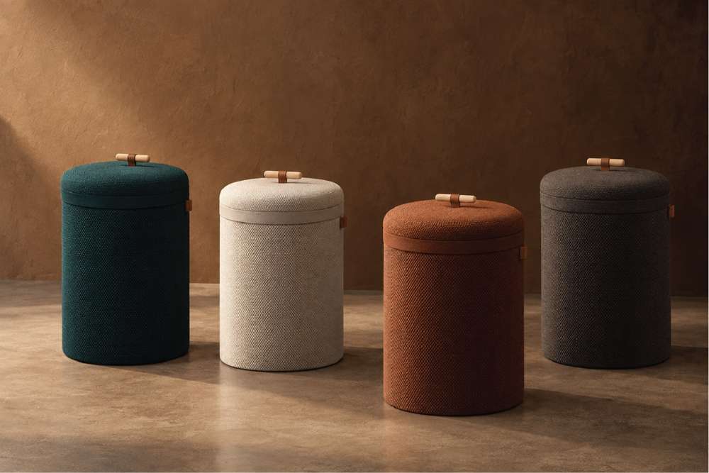
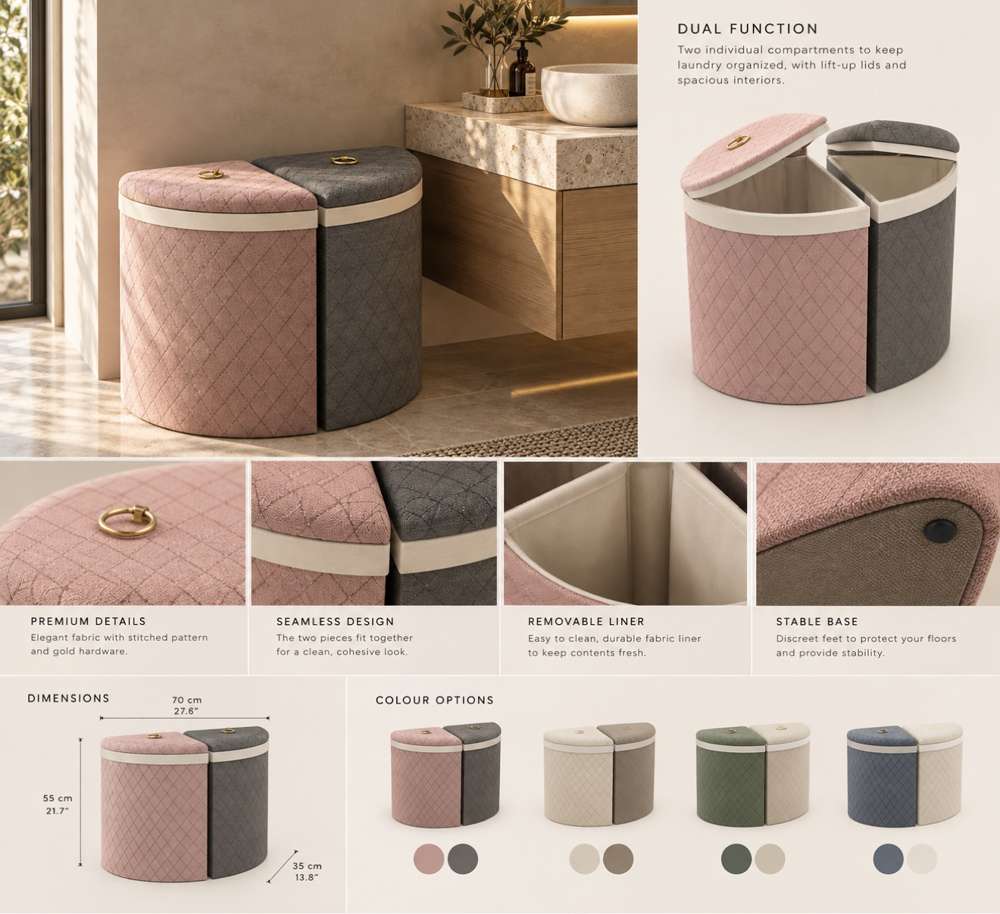
Part of the Kvell collection. Kvell means “to feel happy and proud,” and the hamper family covers laundry two ways. The cylindrical hampers pair a simple upholstered drum with a lidded top and a wooden toggle handle, in palettes that let them sit quietly in a room or act as a colour accent. Alongside them, the dual-compartment hamper builds a small behavioural insight into a finished piece of furniture: two compartments separate lights from darks at the point of use, in a quilted fabric body with gold hardware, a removable liner and a stable base.
For the Kvell collection I led colour direction, art direction and trade-show booth styling, and supported sourcing, specifications, manufacturing direction and quality control.

These upholstered cylinders are hampers: a simple drum silhouette with a lidded top that brings laundry and linen storage into smaller rooms. The wooden toggle handle gives a warm, tactile cue for lifting the lid, while the green, cream, rust and charcoal palette lets each piece sit quietly or act as a colour accent.
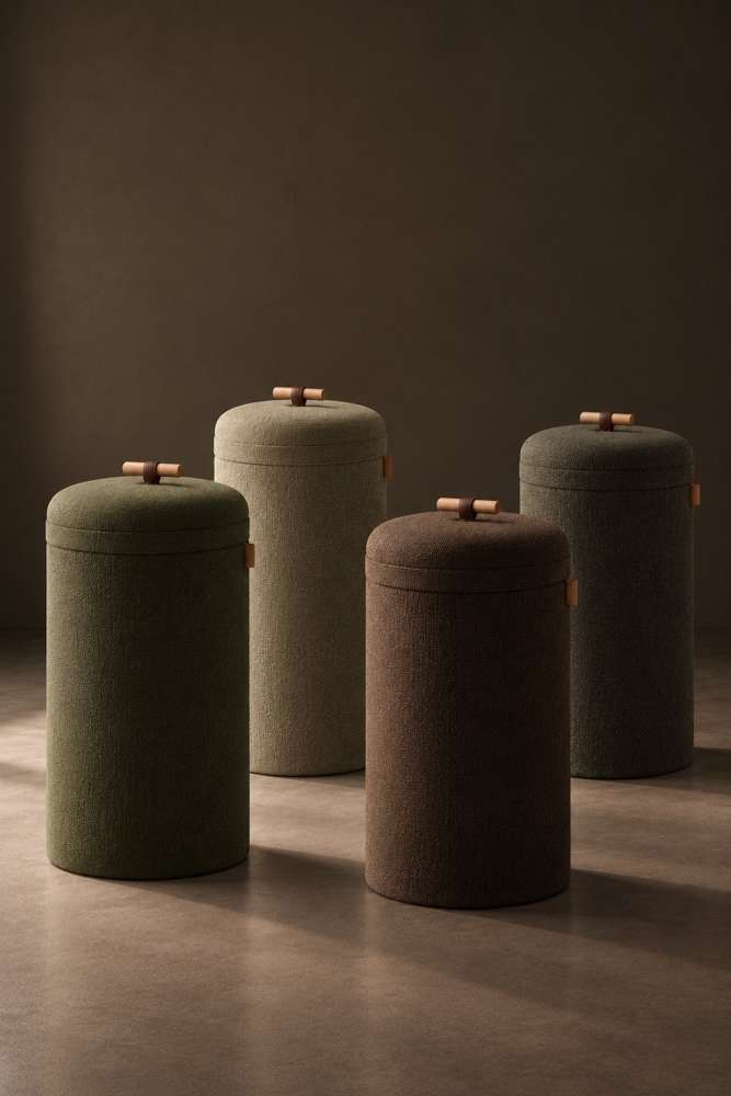
Colour direction · Lid & toggle details · Sourcing · Quality controlThe same cylindrical hamper in olive, sage, brown and charcoal, grouped against a dark plaster wall. The deeper palette turns a storage essential into a quiet sculptural group, the toggle lids reading as a small repeated detail across the four.
Earth-tone palette · Upholstered drum · Toggle lidTwo compartments separate lights from darks at the point of use, a small behavioural insight built into a quilted fabric body with gold hardware, a removable liner and a stable base. At 70 × 55 × 35 cm it holds a family load while reading as a finished piece of furniture, not a utility object.
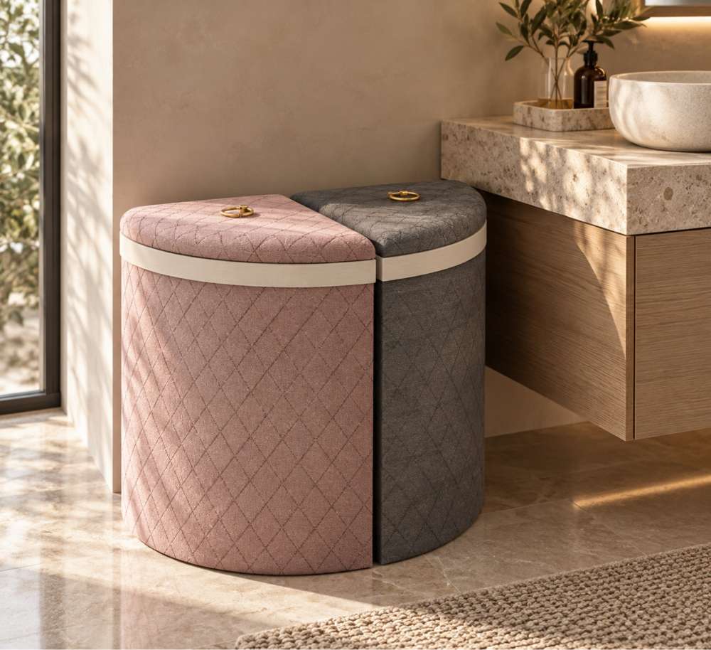
Dual function · Removable liner · Premium hardware · 70 × 55 × 35 cmStyled in a bathroom interior, the hamper’s quilted panels and gold details sit comfortably alongside finished fixtures and stone surfaces. The lifestyle presentation was part of the design work: showing customers that a storage essential could earn its place in the room’s composition.
Art direction · Lifestyle styling · Colour storyMake a laundry essential read as a finished piece of furniture, not a utility object.
I developed the cylindrical hampers around the lidded drum and toggle detail, and built the dual-compartment design around sorting behaviour at the point of use, resolving the quilted fabric body, gold hardware, removable liner and stable base, and art-directing the lifestyle presentation.
Cover laundry two ways: lidded upholstered cylinders for everyday storage, and a two-compartment hamper that separates lights from darks inside the piece itself.
A hamper family: cylindrical upholstered hampers in two palettes, and a dual-compartment hamper at 70 × 55 × 35 cm that holds a family load and sits comfortably beside finished fixtures and stone surfaces.
ReflectionThis project shows how a small behavioural insight can carry a whole product.
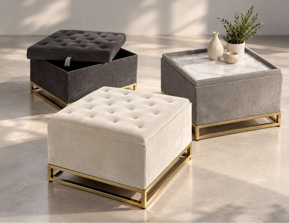
Furniture that folds, opens and stores.
My roleLed colour direction, art direction and trade-show booth styling; supported sourcing, specifications, manufacturing direction and quality control
Kvell means “to feel happy and proud.” The collection carries that spirit into adaptable furniture for contemporary homes, using warm neutrals, muted colours and focused statement tones.
The line began with observing how people actually live in their rooms: where things pile up, where a seat is needed for a moment, where storage runs out. From that came folding, dual-purpose benches, ottomans and stools for customers who needed storage as much as furniture.
I led colour direction, art direction and trade-show booth styling, and supported sourcing, specifications, manufacturing direction and quality control.
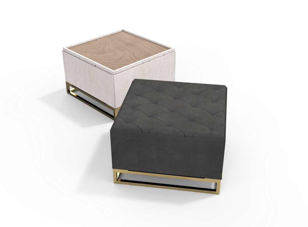

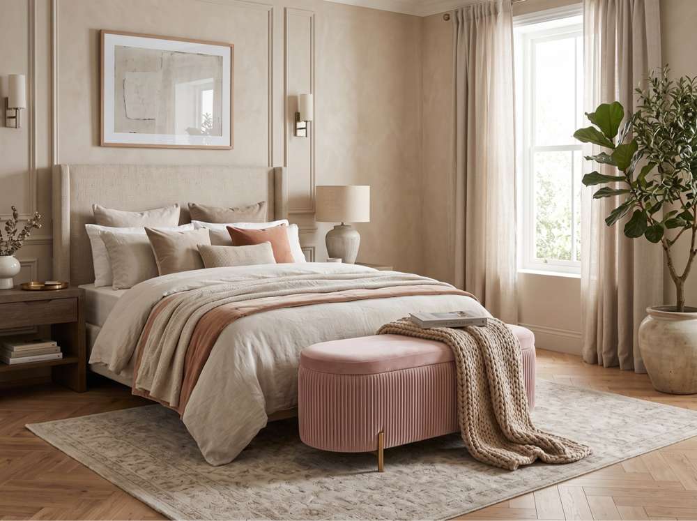
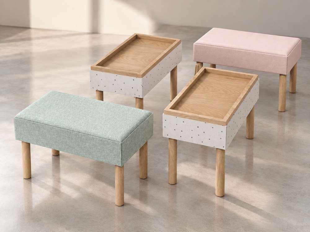
The foldable line began with observing how people actually use small rooms, and how much of it disappears into storage. This bench answers with an inset timber lid that lifts to reveal the capacity inside, while its tufted companion ottoman keeps the same tailored upholstery and brass sled base.
Observation research · Folding & storage design · Inset timber lid · UpholsteryThe square ottoman is the collection’s workhorse: a seat, a footrest and a storage box in a single tufted volume. Shown here in dark grey, cream and a grey version with a marble-look lid, each on the line’s signature gold base, the same piece re-dressed for different rooms and colour stories.
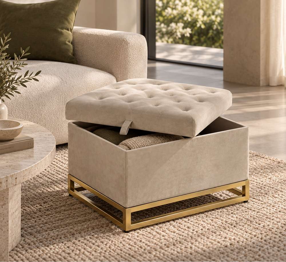
Storage design · Tufted upholstery · Finish direction · Gold baseDeep button tufting and a brushed-gold frame give this ottoman a tailored, almost jewellery-like finish, while the hinged lid opens to the storage cavity inside. It is the foldable line’s promise in miniature: nothing about the storage compromises how the piece looks at rest.
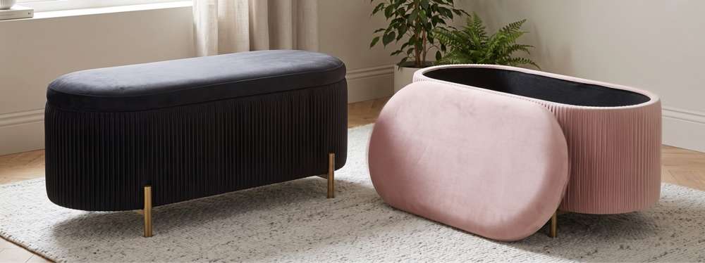
Tufting detail · Hinged storage lid · Metal base · SpecificationsFluted upholstery wraps the oval body of these benches, softening a generous storage volume into a sculptural form. The black and blush pair shows the range of the palette, one graphic and grounded, one light and warm, both lifted on slim gold legs.
Fluted upholstery · Colour direction · Storage volume · Gold legsPlaced where blankets, cushions and tomorrow’s clothes usually land, the fluted bench turns the end of the bed into organised storage. Its blush upholstery and rounded profile keep the bedroom soft, while the lift-up seat keeps the everyday clutter out of sight.
Bedroom storage · Fluted upholstery · Styled presentationThese compact stools pair mint and blush upholstery with terrazzo-look sides and warm wood legs, and their flat tops work as tray tables when a surface is needed more than a seat. The mix-and-match palette lets a set read as a family without matching exactly.
Dual-purpose design · Terrazzo-look finish · Palette systemCreate adaptable furniture for contemporary homes without losing warmth or identity.
I combined market research, sketching, 3D modelling and rendering with sourcing, specifications, booth styling and quality-control review.
Keep silhouettes visually calm while using folding, storage and modular details to make the pieces work harder.
A coherent foldable line supported by colour direction, sourcing, specifications and quality control.
ReflectionThis case shows how I connect product language with manufacturing and presentation.
A softer architectural backdrop.
My roleMarket research, module studies, 3D modelling and specifications
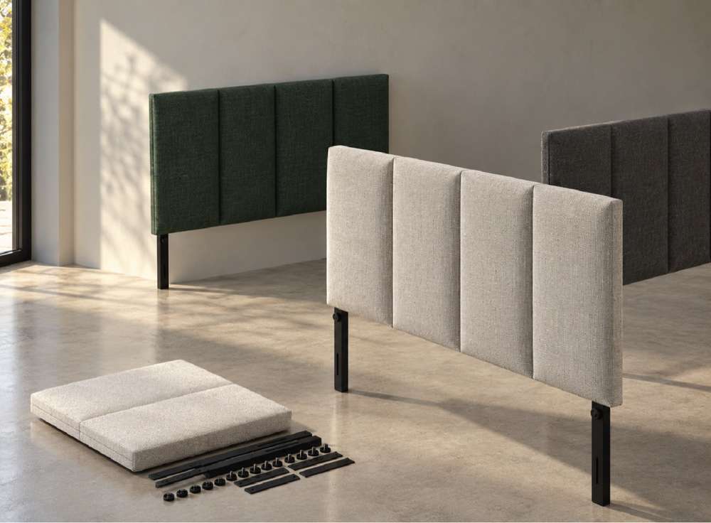
Part of the Kvell collection. Kvell means “to feel happy and proud,” and the headboard brings its calm, upholstered language behind the bed: vertical panels that add acoustic and tactile comfort while the room stays soft and residential.
I developed the headboard through market research, module studies, 3D modelling and specifications.

Vertical upholstered panels create a calm rhythm behind the bed while adding acoustic and tactile comfort. The modular format lets the system adapt across room sizes; tonal textiles and softened corners keep the large surface residential rather than rigid.
Market research · Module studies · 3D modelling · SpecificationsCreate a softer, calmer backdrop for the bed that adapts across room sizes.
I combined market research and module studies with 3D modelling and specifications.
Use modular vertical panels in tonal textiles with softened corners, so the large surface stays residential rather than rigid.
An upholstered panel headboard system that adds acoustic and tactile comfort behind the bed.
ReflectionThis project shows how I use modularity to make one system fit many rooms.
Multidisciplinary designer · Toronto
Product · CosmeticsBeauty packaging led by deep consumer research — interviews, focus groups and insight analysis — from first insight through concept, 3D development, graphics, feasibility and a coherent shelf-ready range.
View original portfolio case studyInside the process · Belcorp cosmetics
The cosmetics work followed the design thinking process, the five-stage cycle developed at Stanford’s d.school. My work centred on its research stages: at Belcorp, each project began with a full week of research, run as a design sprint with qualitative and secondary research, interviews and focus groups, before any design work began.
Understand users through research and observation.
Consumer research — one-to-one interviews and focus groups on daily rituals, habits and frustrations with beauty products.
Synthesize the research into insights and a clear problem statement.
Deep analysis of everything heard — patterns distilled into consumer insights and a focused design brief.
Brainstorm and generate many possible solutions.
Brainstorming and ideation sessions that turned the insights into stories, forms and experience concepts.
Build tangible versions of the ideas.
The packaging design development that followed — strongest concepts carried into sketches, 3D models, renders and prototypes.
Gather feedback and refine — looping back as needed.
Prototypes and production-feasibility review, with refinements fed back into the concepts.
An iterative cycle, not a straight line — testing loops back into new research, sharper insights and better concepts.
For Fascina, I led product design end to end for Belcorp, a beauty company with 50 years in direct sales. It began with listening: consumer interviews, focus groups and deep insight analysis, then design-thinking workshops and brainstorming, before sketches, 3D models, renders, prototypes and production-feasibility review.
The research-first approach paid off on shelf: products from these Belcorp programs became top sellers across the company’s strategic brands, among them the #TRUE fragrance, the CY makeup line, Fashion 101 and Sweet Chic.
Soft pink vessels, rounded proportions and burgundy ribbon details turn a romantic fragrance story into a recognizable family, while each format keeps its scale and use clear.
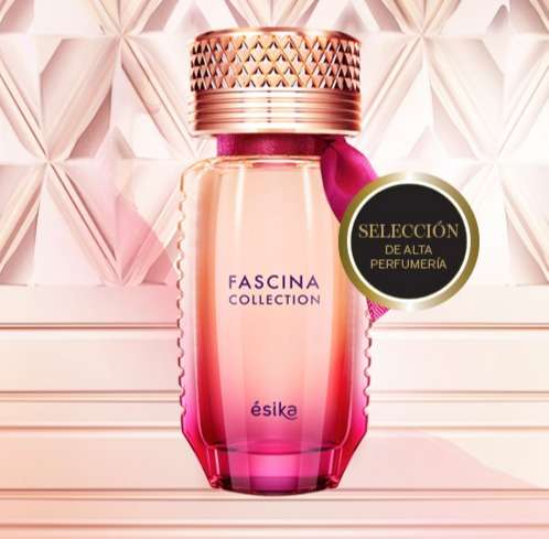
Across cosmetics, makeup and fragrance, every program began with the consumer: interviews, focus groups and deep analysis distilled into insights that briefed the design work. From there, I developed distinct expressions for each program while protecting range consistency and production intent. Each project below is presented with my role, as credited in the original portfolio.
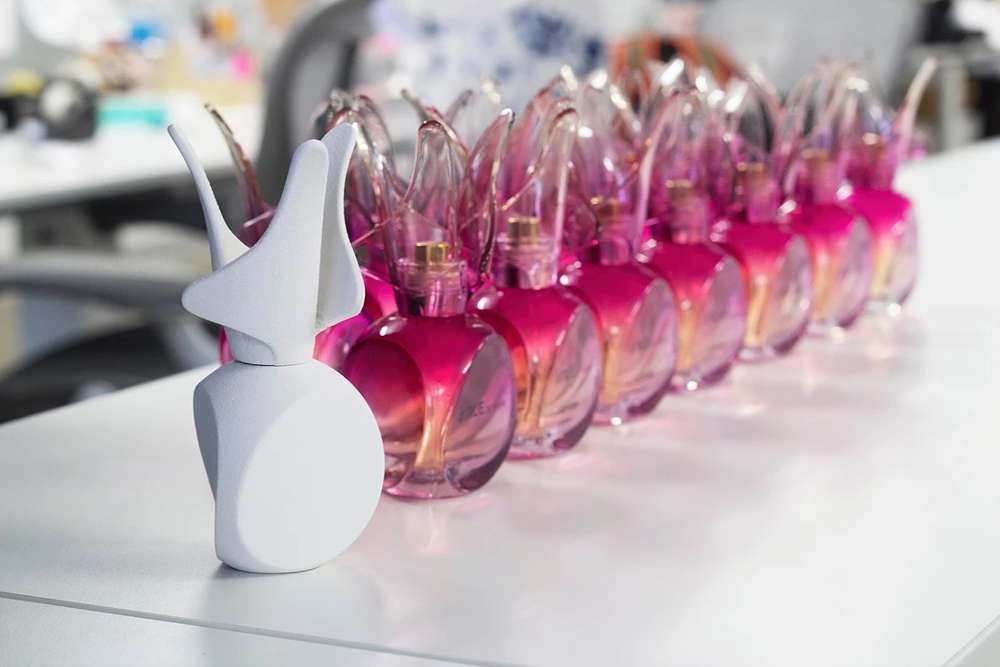
Participated in designing the lid
I participated in designing the fragrance’s lid, contributing to the character and three-dimensional expression of the pack.
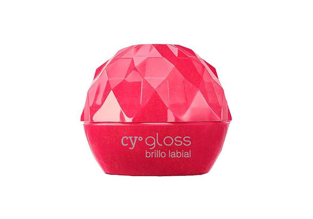
Led the process · Designed final product
I led the design process and designed the final product, carrying the lip-gloss package through the full product-development workflow.
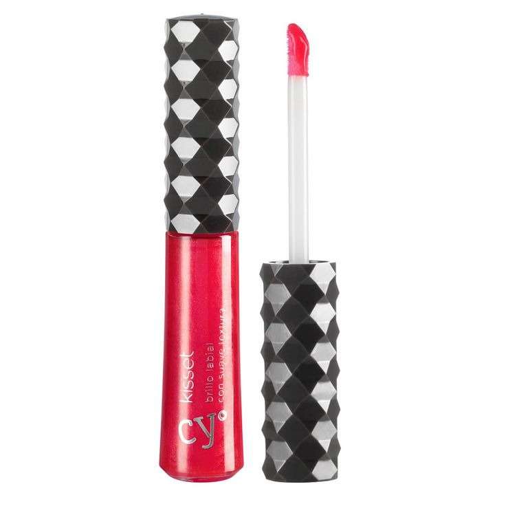
Participated · Designed final product
I participated in the design process and designed the final product, shaping the package from the larger team process into its resolved form.

Participated · Co-designed final product
I participated in the design process and co-designed the final product as part of the wider beauty-packaging team.

Led the process · Designed final product
I led the design process and designed the final product, refining the relationship between vessel, closure and applicator.
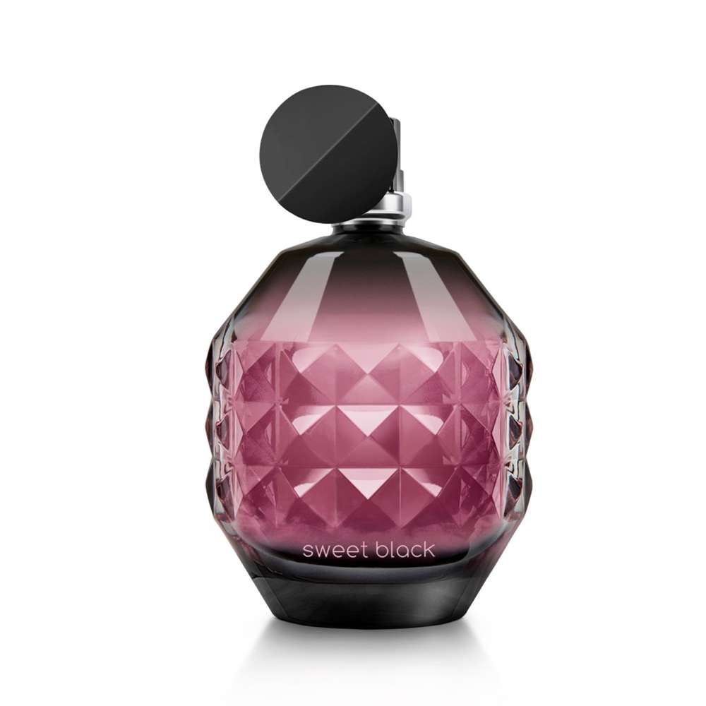
Led the process · Designed final product
I led the design process and designed the final product, from early concept and form studies through its resolved package.
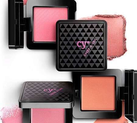
Led the process · Designed entire line set
I led the design process and designed the entire makeup-line set for one of the brand’s most important makeup lines.
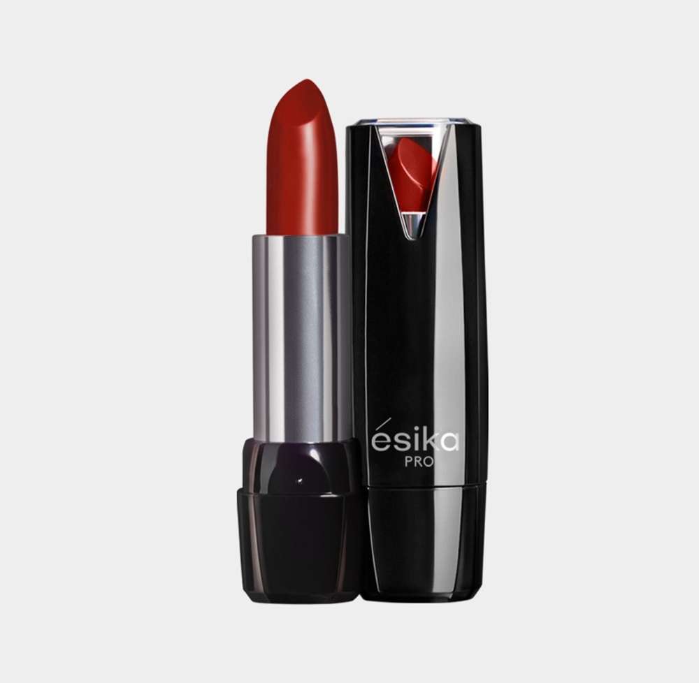
Participated · Designed final product
I participated in the design process and designed the final product, carrying the lipstick package into its resolved production expression.
Multidisciplinary designer · Toronto
Product · TechnologyTwo product projects that make advanced technology easier to understand, hold and trust.
Medical dry-herb vaporizers use sophisticated technology, but the experience depends on simple human moments: loading, gripping, controlling heat, reading feedback and cleaning. This project made usability and inclusivity central to the product family, starting from the brand’s identity and the values the product had to express.
I began with business goals, brand values and target users, then used surveys, secondary research and competitor analysis to find the pain points. Size, ergonomics, heat control and interface clarity became the development priorities.
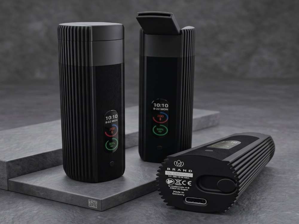
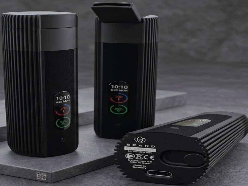
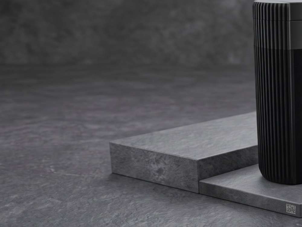
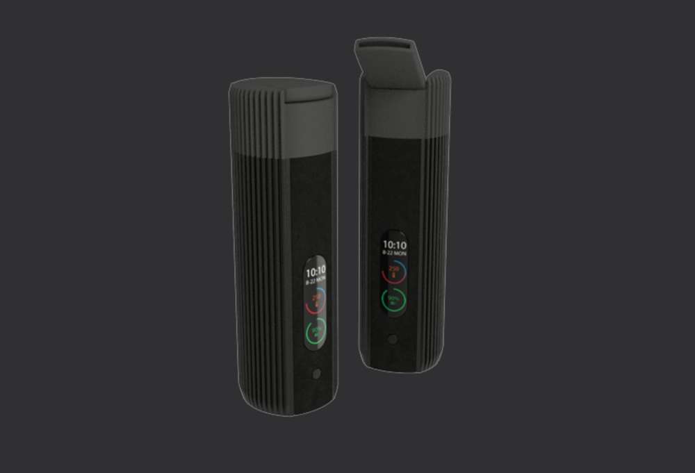
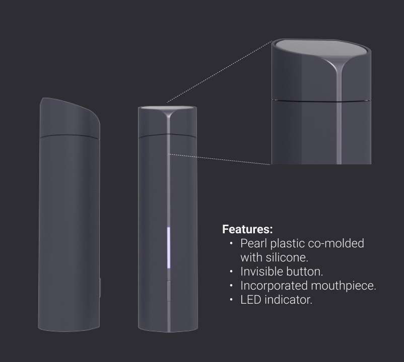
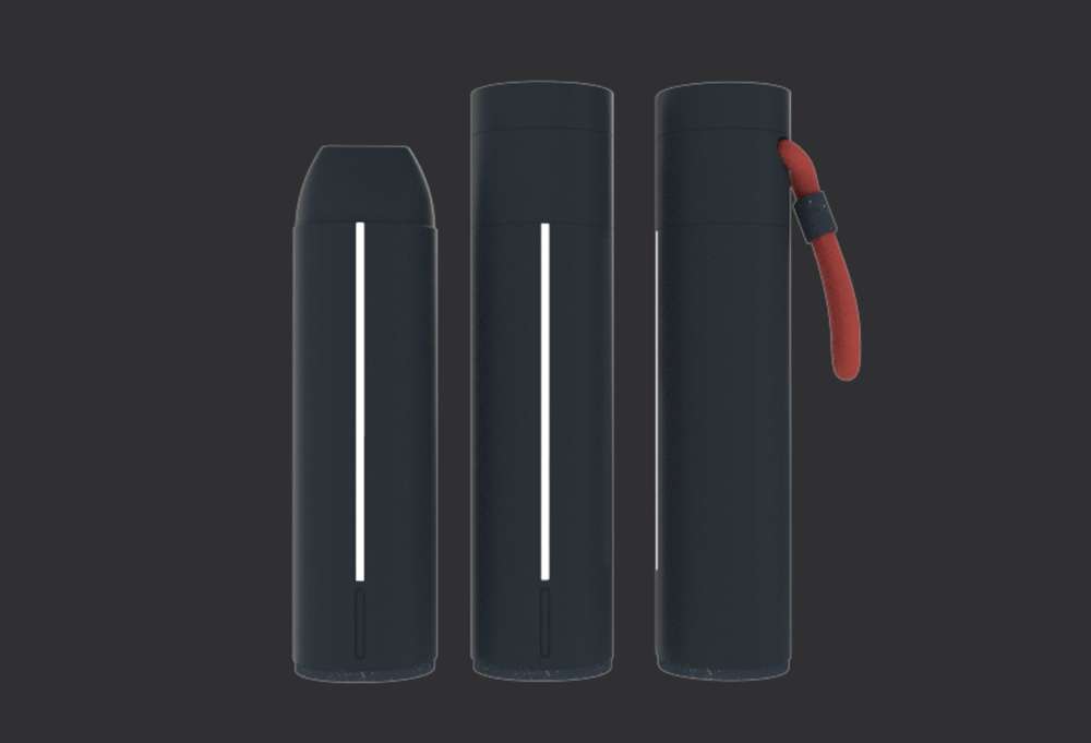
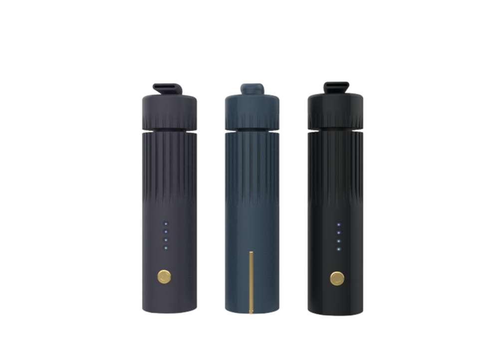
The control layout, heat feedback and charging architecture were developed as one clear interaction sequence.
A high-contrast display keeps temperature and status information legible at a glance.
Ribbing and body proportions support secure handling while helping users orient the device by touch.
The display was designed as part of the product: temperature and status stay legible at a glance, with simple colour feedback for heat and readiness.
A pearl-plastic body co-moulded with silicone, an invisible button, an incorporated mouthpiece and an LED indicator — the feature set the family was built around.
Three body directions compared for grip, proportion and light feedback before the family form was locked.
The grip, button and light language stay constant while the finish changes — brand identity carried through the range.
Three-dimensional prints supported testing of mouthpiece orientation, display size and grip. Feedback drove new alternatives and focused iterations before materials and manufacturing processes were defined with the wider team.
Partway through development, the brand chose to keep its existing aesthetics rather than move to a new visual language. Co-creation sessions with the wider team realigned the usability work, grip, heat control and display clarity, with that identity, so the final product feels familiar while answering modern user needs.
My roleDesigned the exterior case of every device in the kit
X-Matik develops automation technologies. LaneCruise™ was presented as a universal after-market semi-autonomous kit for vehicles with zero onboard automation, bringing hands-free safety, productivity and convenience without requiring a new car.
I designed the exterior case of every device in the kit, documented through inspiration boards, sketching, 3D modelling, hand rendering and design recommendations. Three redundant methods of disengagement keep the driver safe and in control. Data collection was AI-assisted; the analysis and every design decision remained mine.
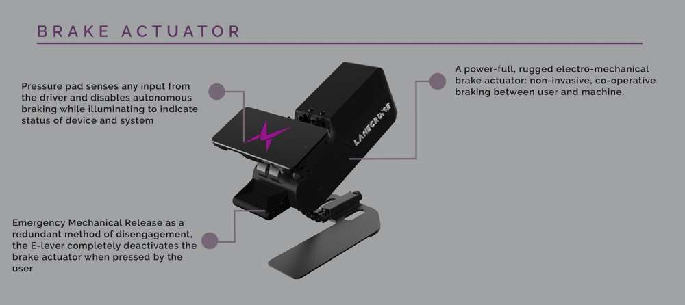
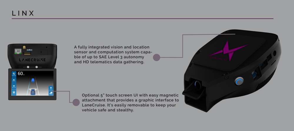
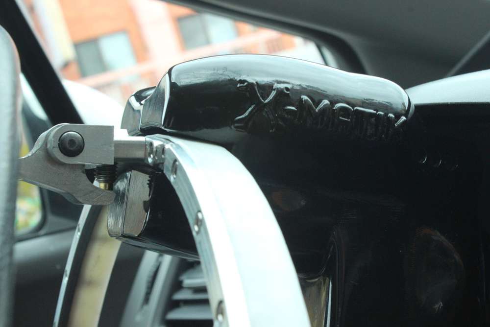
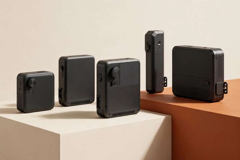
The portfolio presentation explains the actuator housing and its mechanical-release access.
Vision, location and interface hardware are organized as a coherent family rather than unrelated devices.
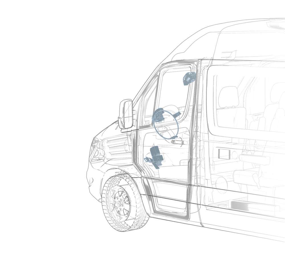
The installed hardware shows how the universal kit integrates with an existing vehicle environment.
Case studies align the kit through shared proportions, surfaces and details.
A line study from the original portfolio maps where each device sits inside the vehicle — the exterior cases were designed as one family across all of them.
Universal after-market system
Multidisciplinary designer · Toronto
Product · Retail DisplaysIn-store displays where product, brand and shopper meet: five beauty retail projects for Sephora, Ulta and Montréal Airport.
360° Beauty Retail Experience, Montréal Airport. A freestanding display with organic curves, layered shelves and integrated lighting, made to be discovered from every direction.
A freestanding fixture in an airport, readable from every side.
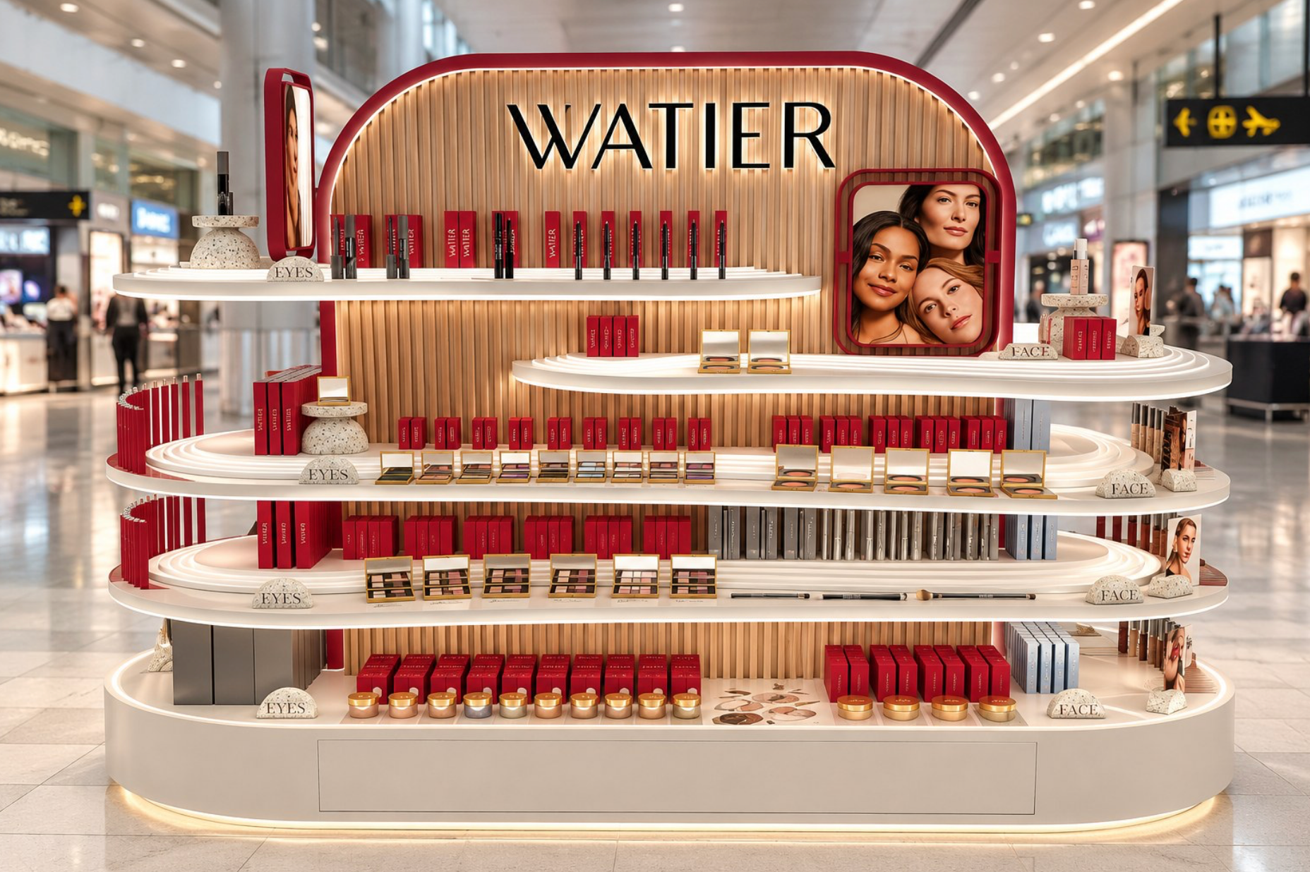
In context at Montréal Airport.
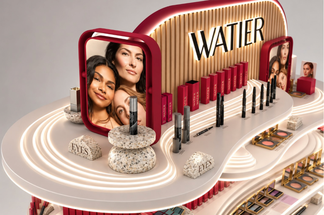
Detail, EYES category: glorifier pedestal, LED-lit curves.
Continuous curves and staggered shelves guide shoppers around the fixture, with products visible from every viewpoint.
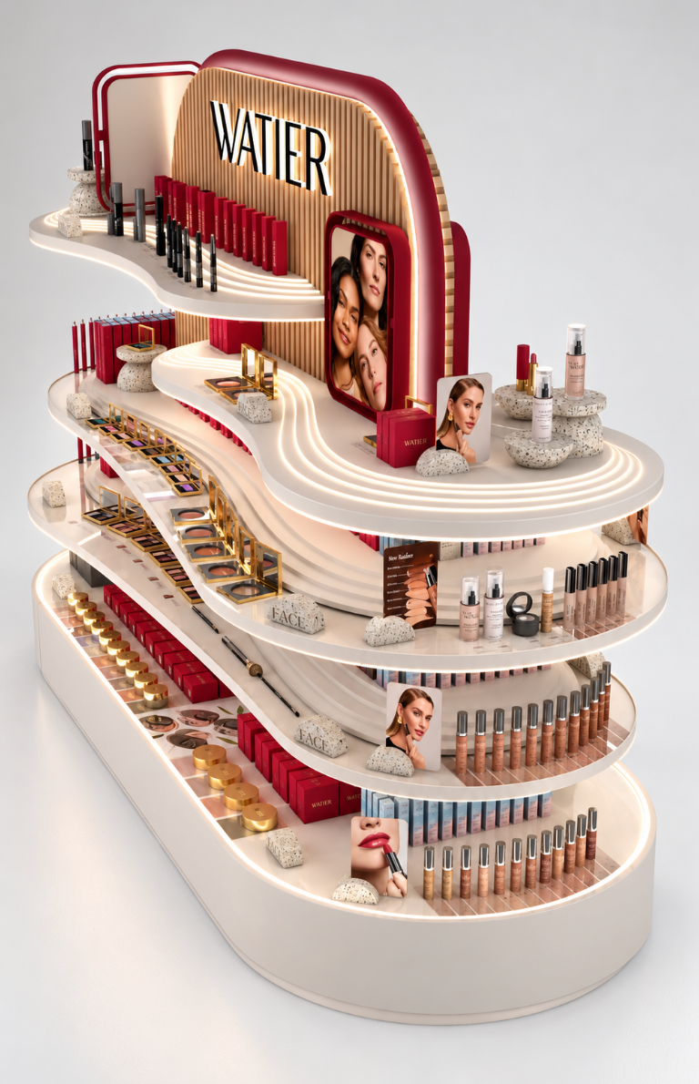
High-angle view: the full 360° form, staggered shelves wrapping the fixture.
Open and freestanding, so shoppers approach from every direction.
Sculptural curves with a strong aisle presence.
Three-layer back panel; recessed LED traces the curved shelves.
Backlit 3D WATIER logo in the back panel.
Sculptural shelves and glorifiers lift hero products.
Warm wood slats, light shelving, deep burgundy, stone accents.
Holders, trays and EYES / FACE markers, plus a concealed base drawer.
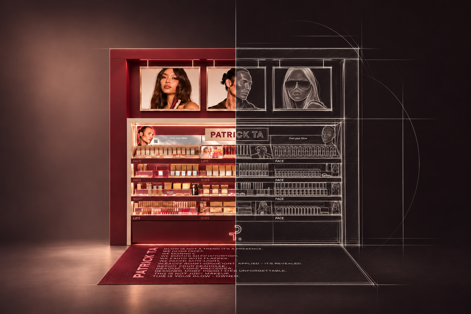
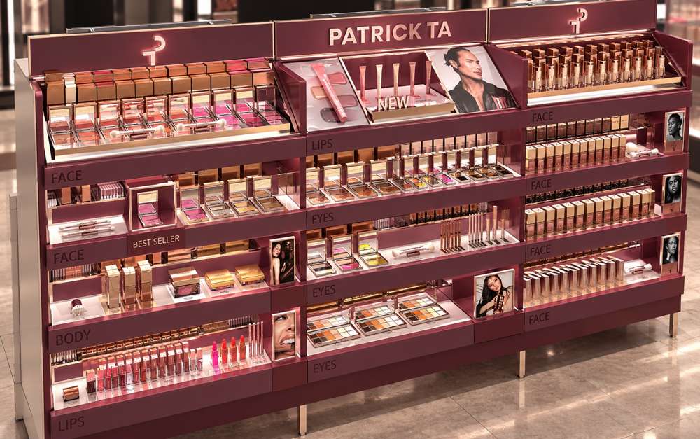
Retail Experience Design, Sephora. Two display concepts for PATRICK TA at Sephora, the Iconic Wall and the Prestige Gondola, turning the brand’s pop-up atmosphere into permanent fixtures: burgundy finishes, metallic accents, integrated lighting, campaign imagery and merchandising for the full assortment.
Translate a pop-up atmosphere into permanent Sephora fixtures, without losing organised merchandising for the full assortment.
Concept film: the PATRICK TA retail experience, the Iconic Wall and the Prestige Gondola. Watch on Vimeo
The pop-up atmosphere brought into Sephora: burgundy architecture, branded carpet, statement typography, illuminated displays and portrait holders.
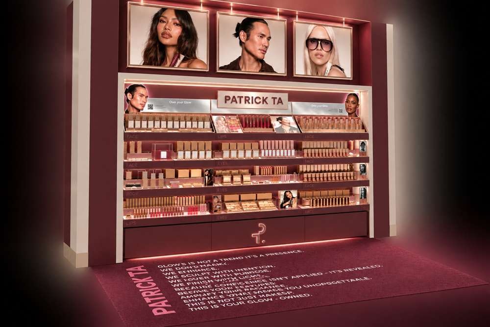
Iconic Wall, angled studio view.
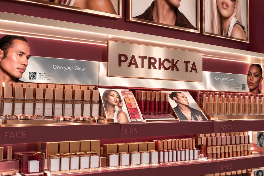
Detail: PATRICK TA signage and “Own your Glow” panels.
Burgundy architecture, graphics and branded flooring.
Campaign portraits woven through the shelving.
Shelf lighting with a warm metallic glow.
FACE / EYES / LIPS / BODY, clearly signed.
Illuminated signage and the signature monogram.
The same premium identity in a modular, product-focused fixture: burgundy and warm metallics, illuminated shelving, testers and promo storytelling.
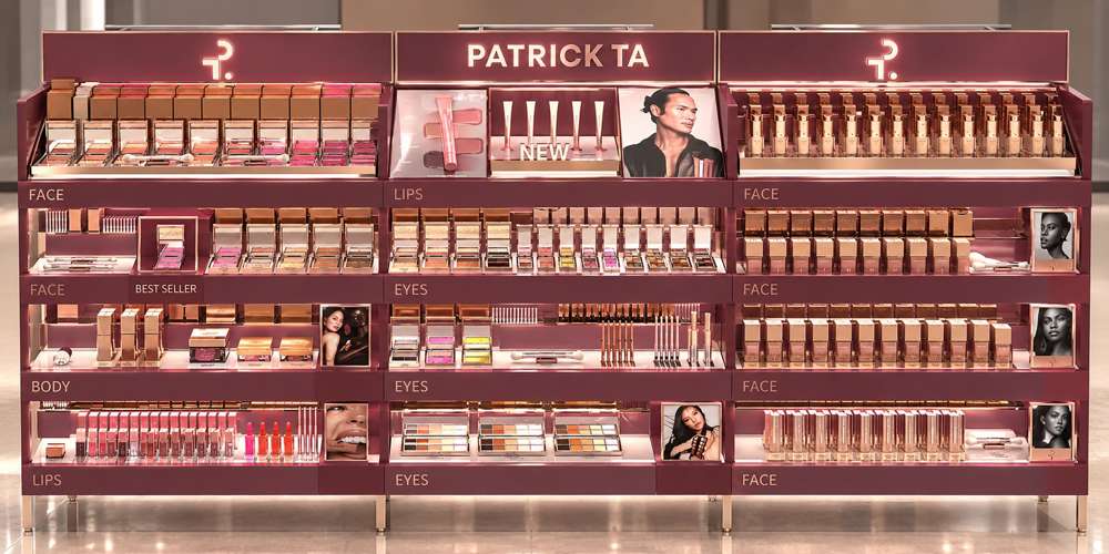
Prestige Gondola, front view.
Prestige Gondola, angled view.
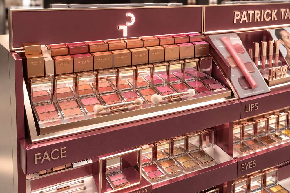
Detail: FACE blush trays and testers.
Trays and configurations matched to each product format.
Inclined surfaces for better product visibility.
Illuminated shelves and headers throughout.
NEW and best-seller focal areas.
Portraits, category labels and signage built in.
Burgundy, metallics and transparent holders, coordinated with the Wall.
Pro Brush Display | Shelving & Merchandising System Design. A redesign of the shelving and display system for Ulta’s existing multi-brand hairbrush gondola: new mechanisms for different sizes, packaging and brands, inside the original fixture.
Keep brushes organised while people shop, with flexibility built around a hanging feature. Each direction was weighed against accessibility, merchandising density, visual organisation and fit with the existing gondola.
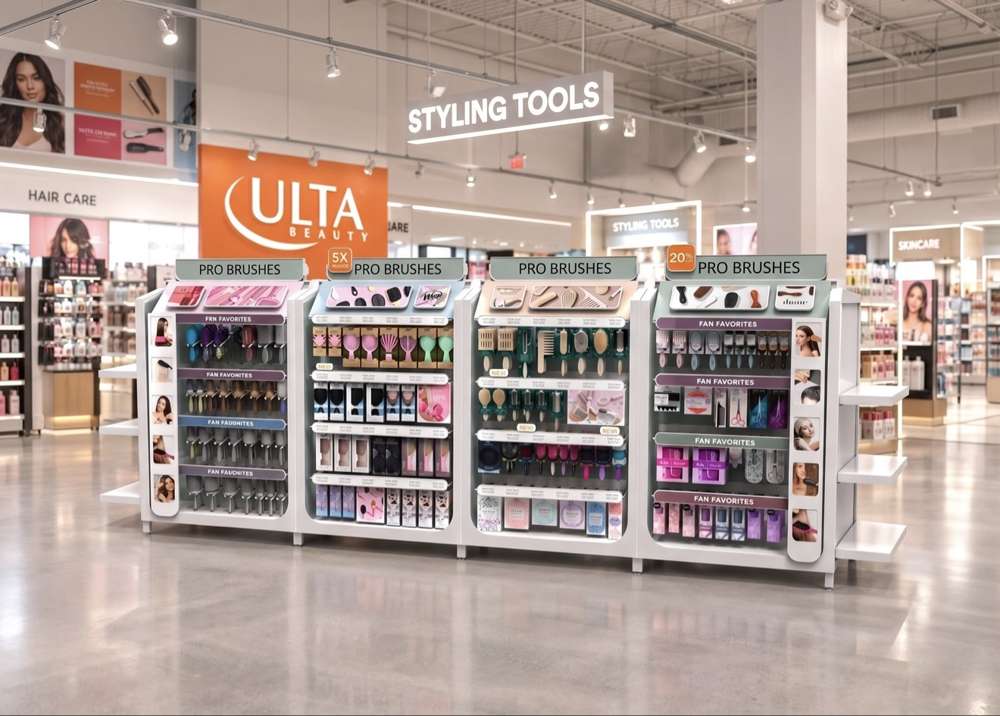
In store at Ulta Beauty.
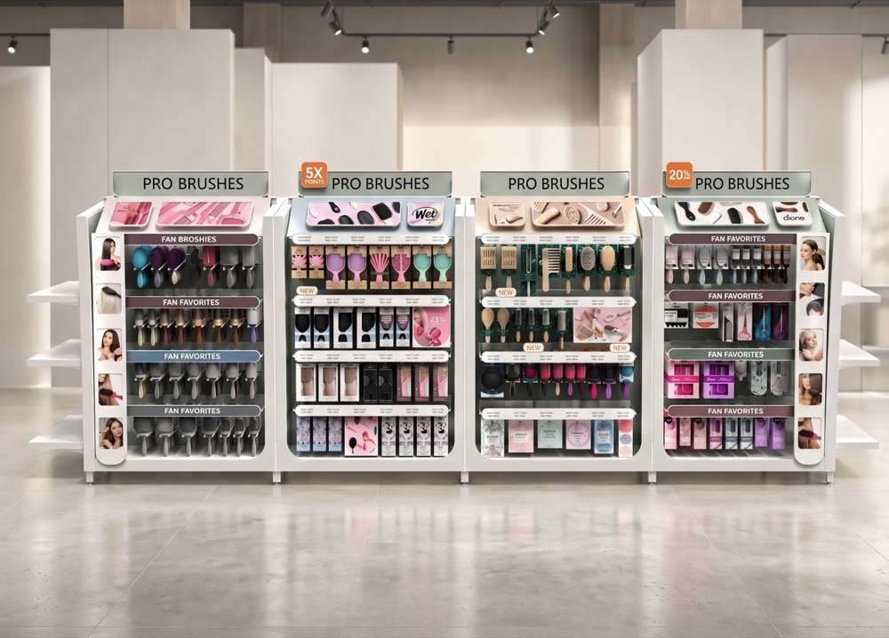
Angled view: hanging bays, side shelves.
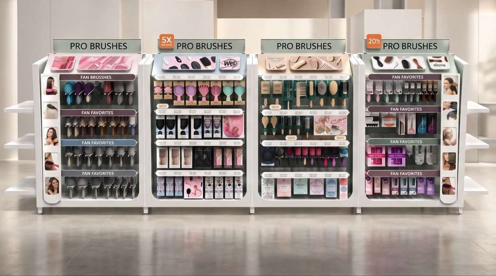
Front view: graphics on top, brushes hanging below.
Built around the original gondola frame and dimensions.
Shelf and hanging configurations. The hanging construction doubles as graphic space: top shelf or graphics above, product hanging below.
Simplified parts and attachments: easy assembly, installation and maintenance.
Durable retail finishes matched to the existing fixture.
Product info, brand graphics and promotions built into the system.
Promotional Displays, Sephora & Ulta. Six displays for the Pro Filt’r foundation launch, from Concept 2 of the design presentation: three for Ulta, three for Sephora. Corrugated cardboard builds with acrylic glorifiers and printed graphics carrying the 50 Shades launch message.
Six launch displays across two retailers, all in corrugated builds.
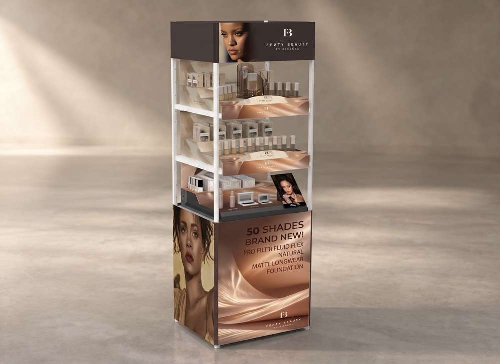
Large Étagère, studio render.
A compact two-level tower for Ulta, in die-cut corrugated cardboard with an acrylic glorifier and a brush tester glued directly to the display.
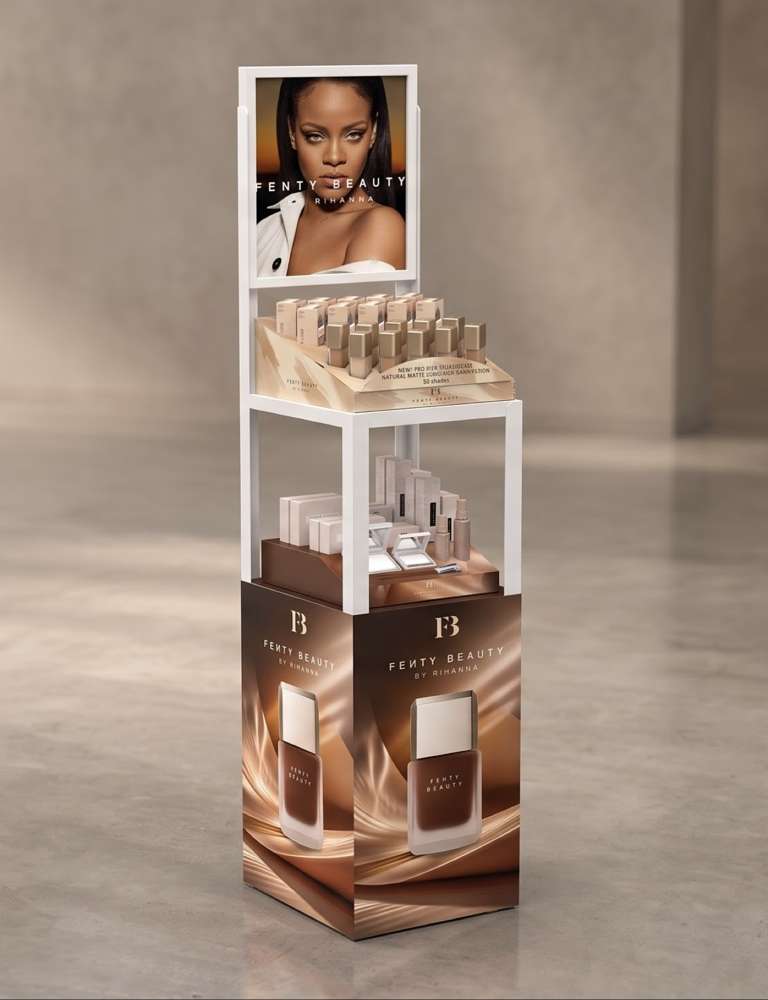
Small Étagère, studio render.
E-flute corrugated cardboard.
A lightweight, elevated presentation.
Fixed directly to the display, a clean and integrated look.
Customers can try the tester in place.
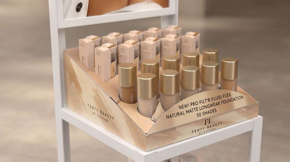
Small Étagère, tray detail: Pro Filt'r Fluid Flex foundation, 50 Shades.
A tall, open tower for the launch assortment: two-step shelves, a premium acrylic glorifier and layered acrylic back panels with a soft, wavy effect.
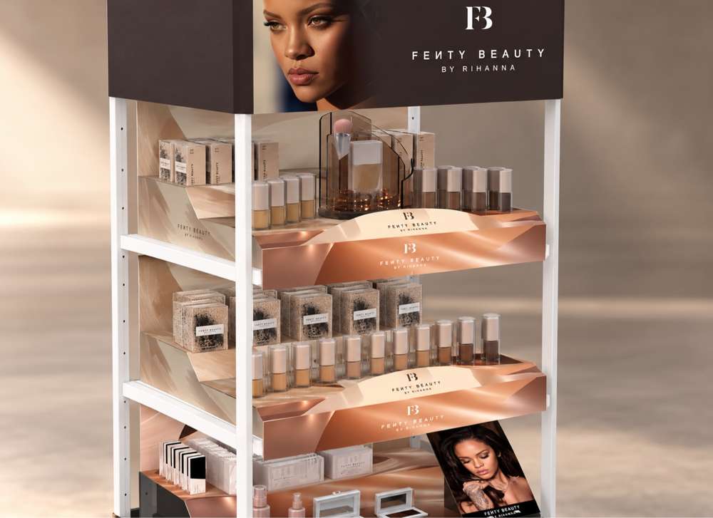
Large Étagère, closer view: two-step shelves, brass-finish glorifier.
Stepped levels for product visibility and backstock access.
Focal point with a brass film finish.
Acrylic layers with a soft, wavy effect.
50 Shades message across the base panel.
A table-format display with a full-height graphic back panel and the launch message across the front, in silk tones matched to the foundation campaign.
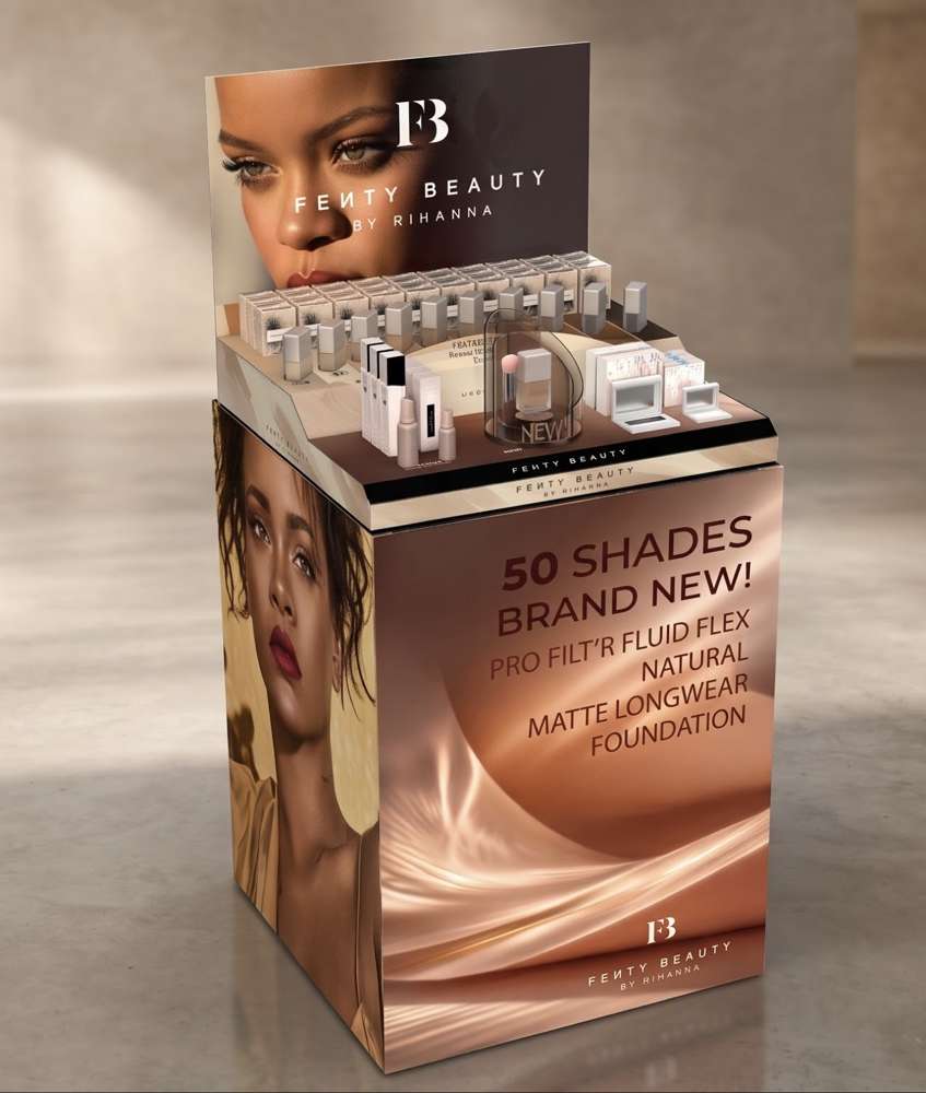
Large Table, studio render.
Direct-print corrugated cardboard, clean and efficient.
A focal point on the tabletop.
Full-height face imagery and branding.
50 Shades launch message, printed across the front.
A gondola endcap for Sephora in direct-print corrugated cardboard, with a premium acrylic glorifier and a graphic panel on the lower shelf.
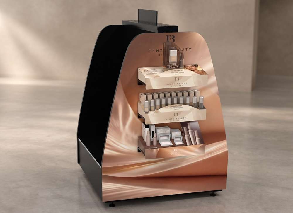
Endcap, studio render.
Corrugated cardboard throughout.
A polished focal point at the top.
On the lower shelf, for brand visibility and impact.
Consistent with the overall fixture family.
Two nested tables for Sephora in die-cut corrugated cardboard, with a premium acrylic glorifier and a graphic panel on the upper table.
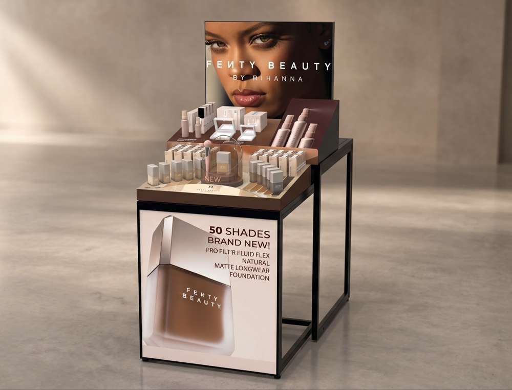
FOS Nested Tables, studio render.
E-flute corrugated cardboard.
An elevated presentation on the lower table.
On the upper table, for brand visibility.
Clean and modern, two tables nested as one unit.
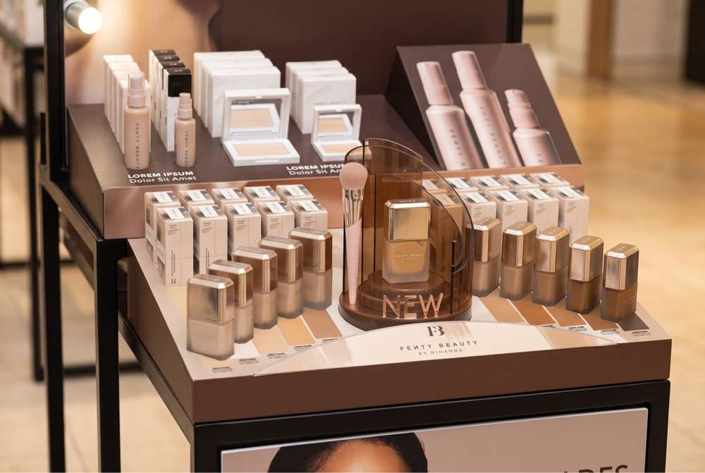
FOS Nested Tables, closer view: NEW glorifier, shade chart up front.
A tall tower for Sephora in die-cut corrugated cardboard, with an acrylic glorifier and graphic holders built into the two lower shelves.
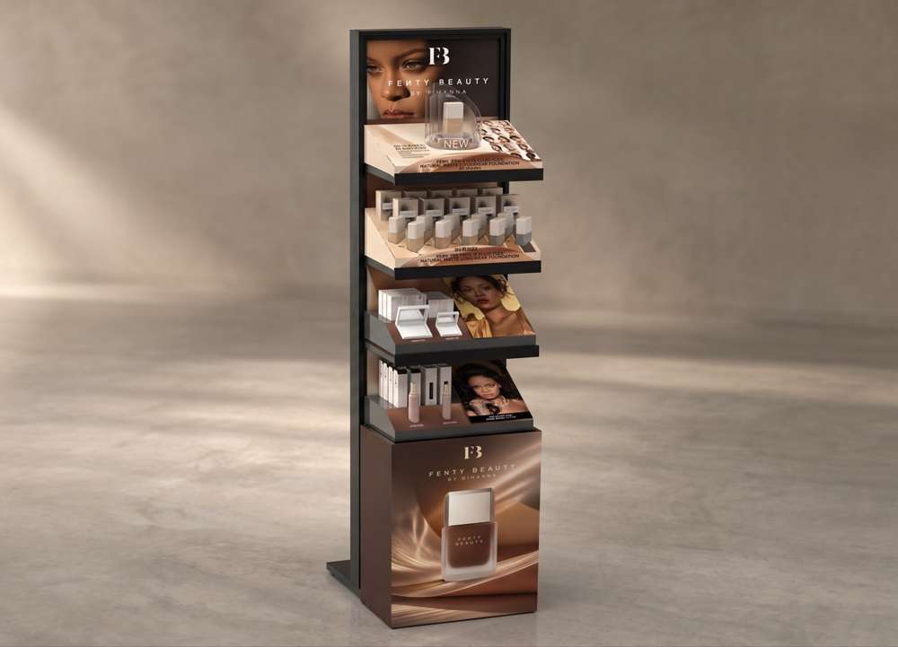
Tip Tower, studio render.
E-flute corrugated cardboard.
A refined finish on the top shelf.
Integrated into the two lower shelves, for branding.
50 Shades message on the base panel.
Ulta Gondola, Overhaul Launch 2027. A gondola overhaul concept for Dashing Diva at Ulta: a modular insert frame that replaces standard shelving in a small footprint, switching between peg hooks for hanging product and shelves for stacked product, with a focus top shelf, illuminated header and graphic holder module.
One small-footprint frame that switches between hanging and stacked setups, inside a standard gondola bay.
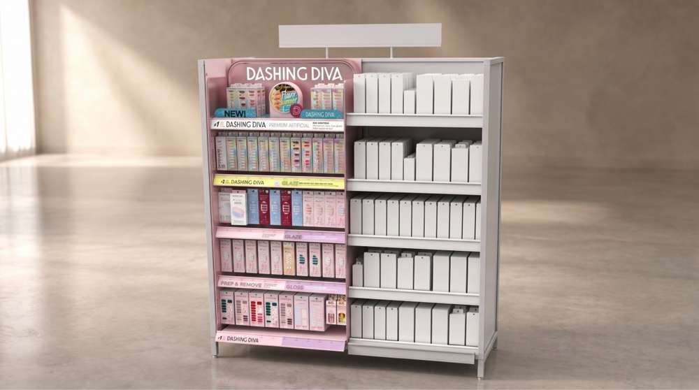
Ulta Gondola, front view in the fixture.
One adaptable frame for the full assortment: the top shelf works as both header and central focus unit, with a dedicated zone for new launches.
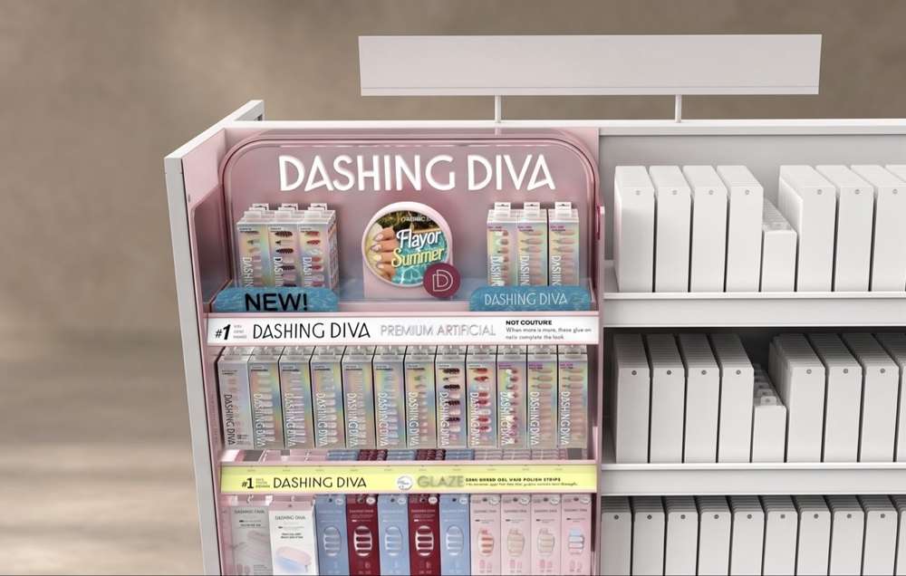
The gondola bay, closer view: header, focus shelf, hanging sets.
Header and central focus in a single shelf.
A versatile module for brand storytelling.
A dedicated area for the latest product launches.
Peg hooks for hanging items, shelves for stacked product.
Three graphic holder options for the focus shelf, each sized to a different kind of launch story.
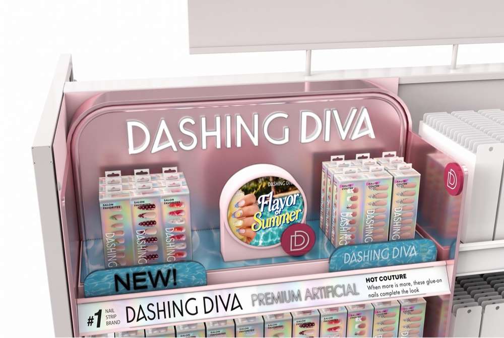
Focus top shelf, studio render: circle graphic holder.
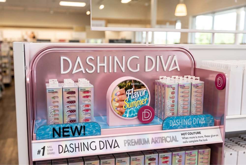
Focus top shelf in store: Flavor of Summer circle graphic, NEW strip.
Angled wedge format for campaign graphics.
Round format, shown here on the focus shelf.
Wide format for imagery and messaging.
Three ways to build the top shelf module, each with graphics that can be swapped as launches change.
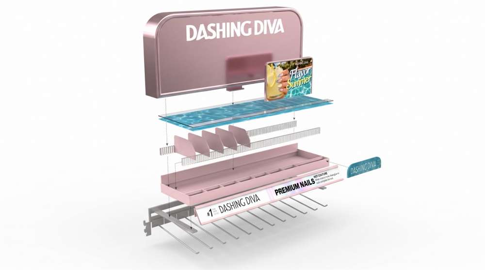
Top shelf module, exploded view.
Custom-colored vac-forms in three sections; the interchangeable graphic sits protected under a clear acrylic top layer.
Metal tray with a trapped graphic and an acrylic top template.
Adjustable dividers for different product types, with an optional graphic top template.
Large vac-formed header with radius corners and a large lit Dashing Diva logo.
Top shelf focus with an updatable vac-form insert and a clear lens at the front.
Custom colored acrylic wrapping the header.
Optional acrylic letters on the front strip for category navigation.
Updatable paper graphics that slot into channels and flip up to show UPC information.
Maximum efficiency inside a 2ft bay of standard gondola.
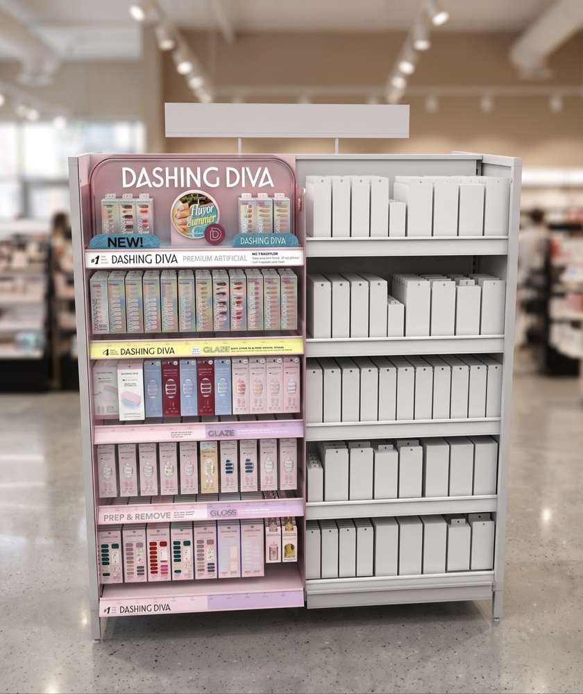
The full gondola in store: pink bay merchandised end to end.
Multidisciplinary designer · Toronto
Logos, websites and graphic systems — one clear identity carried through every touchpoint, from packaging to place.
Brand identity & graphic design · Identity carried through every touchpoint
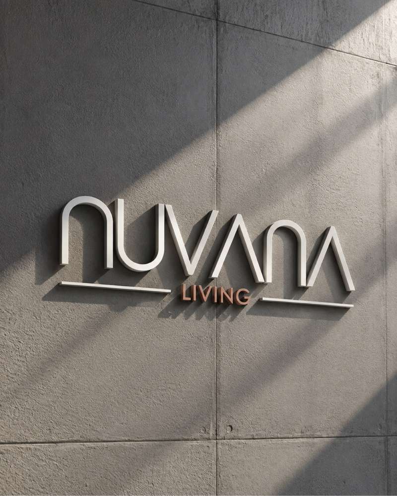
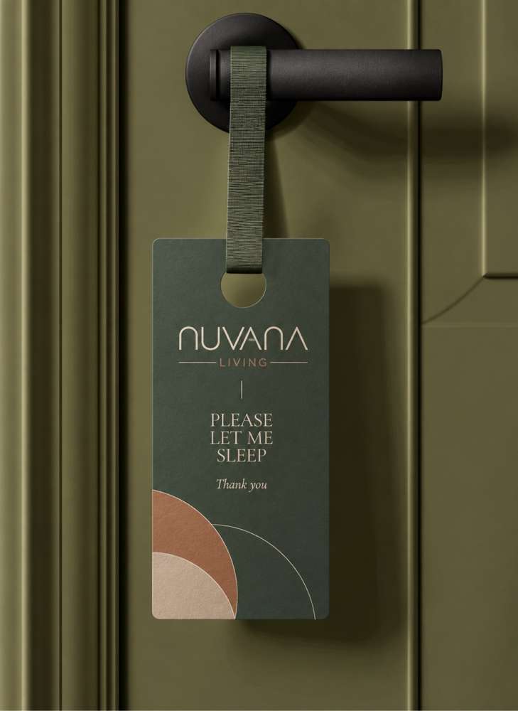
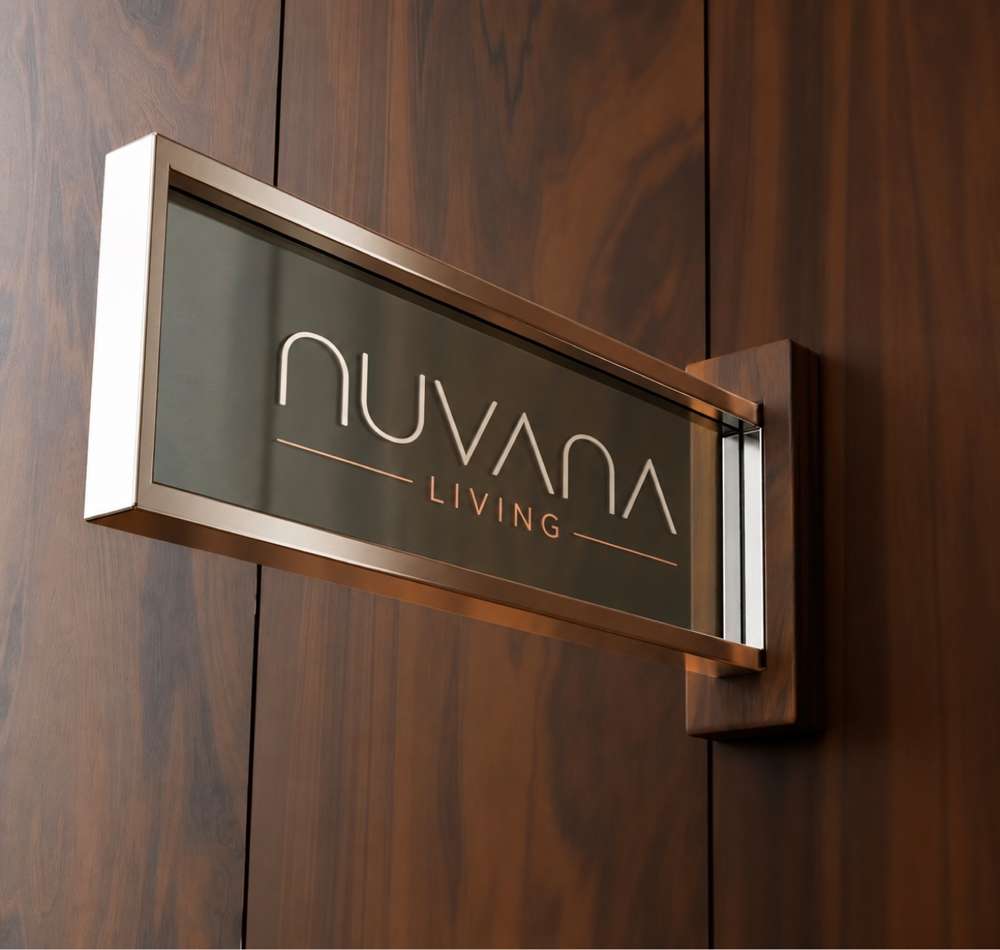
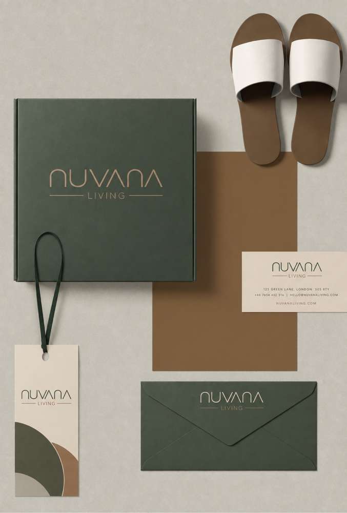
My roleDesigned the logo and website; styled all eight rental units
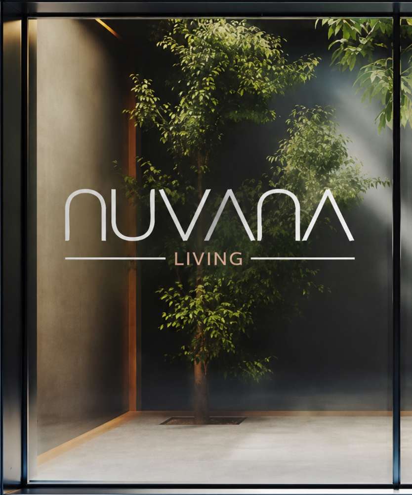
Nuvana Living needed a polished, welcoming identity for its premium rental experience in Bogotá’s Zona G. I designed the logo and website, shaping a clear digital journey through the Loft, Penthouse, Deluxe and Executive accommodation.
The outcome is a connected guest story: the brand introduces the experience online, while my styling of all eight rental units carries its warm, contemporary character into the spaces themselves.
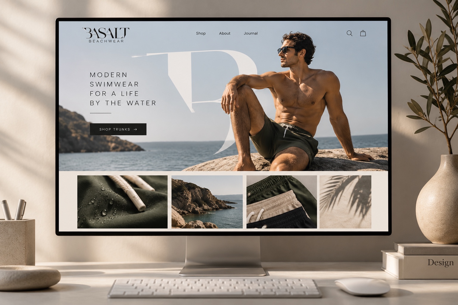
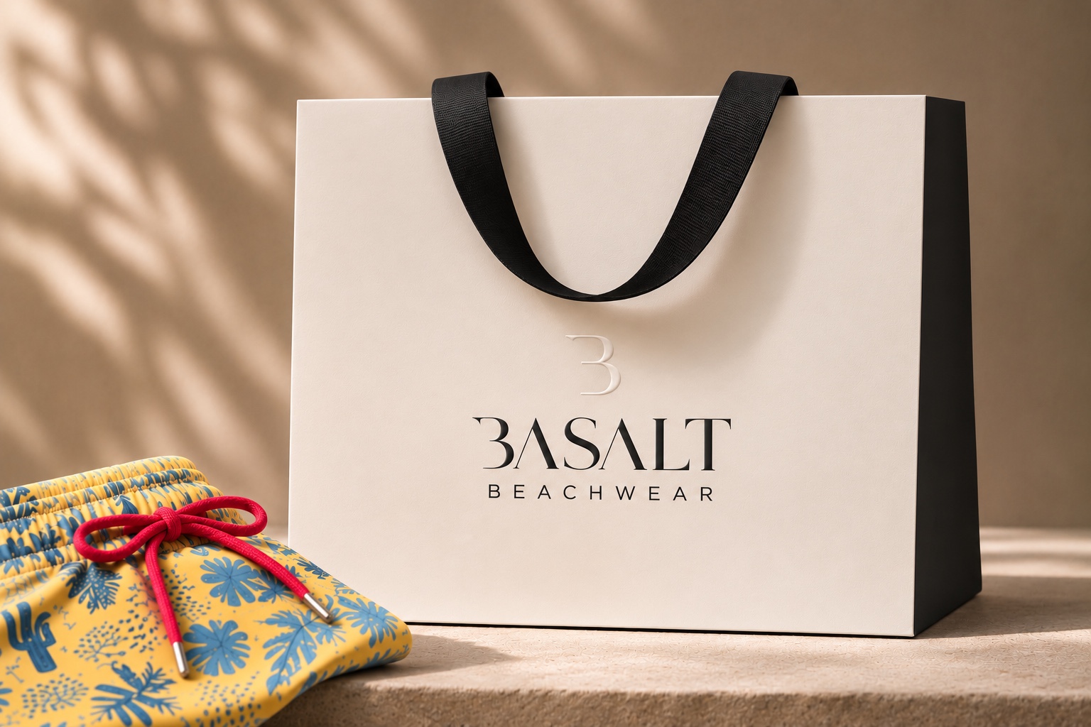
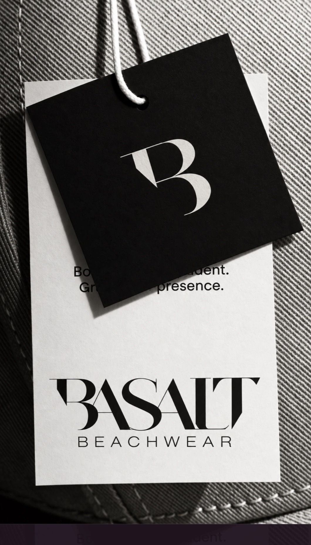
My roleDesigned the logo and built the graphic language around its letterforms
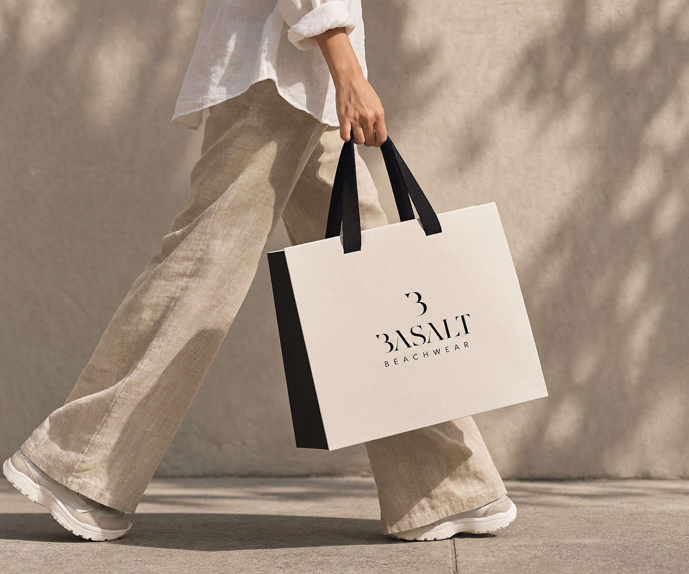
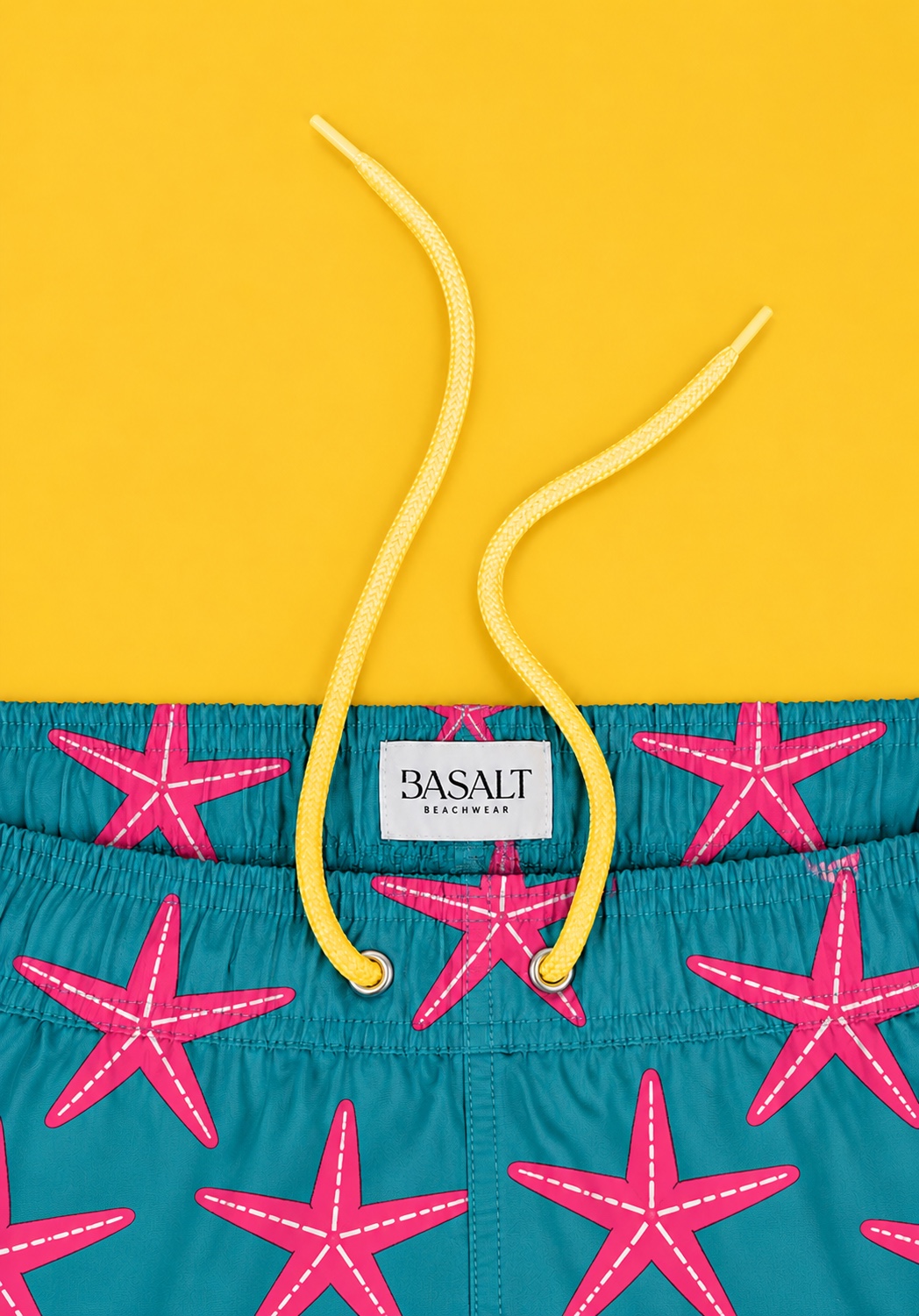
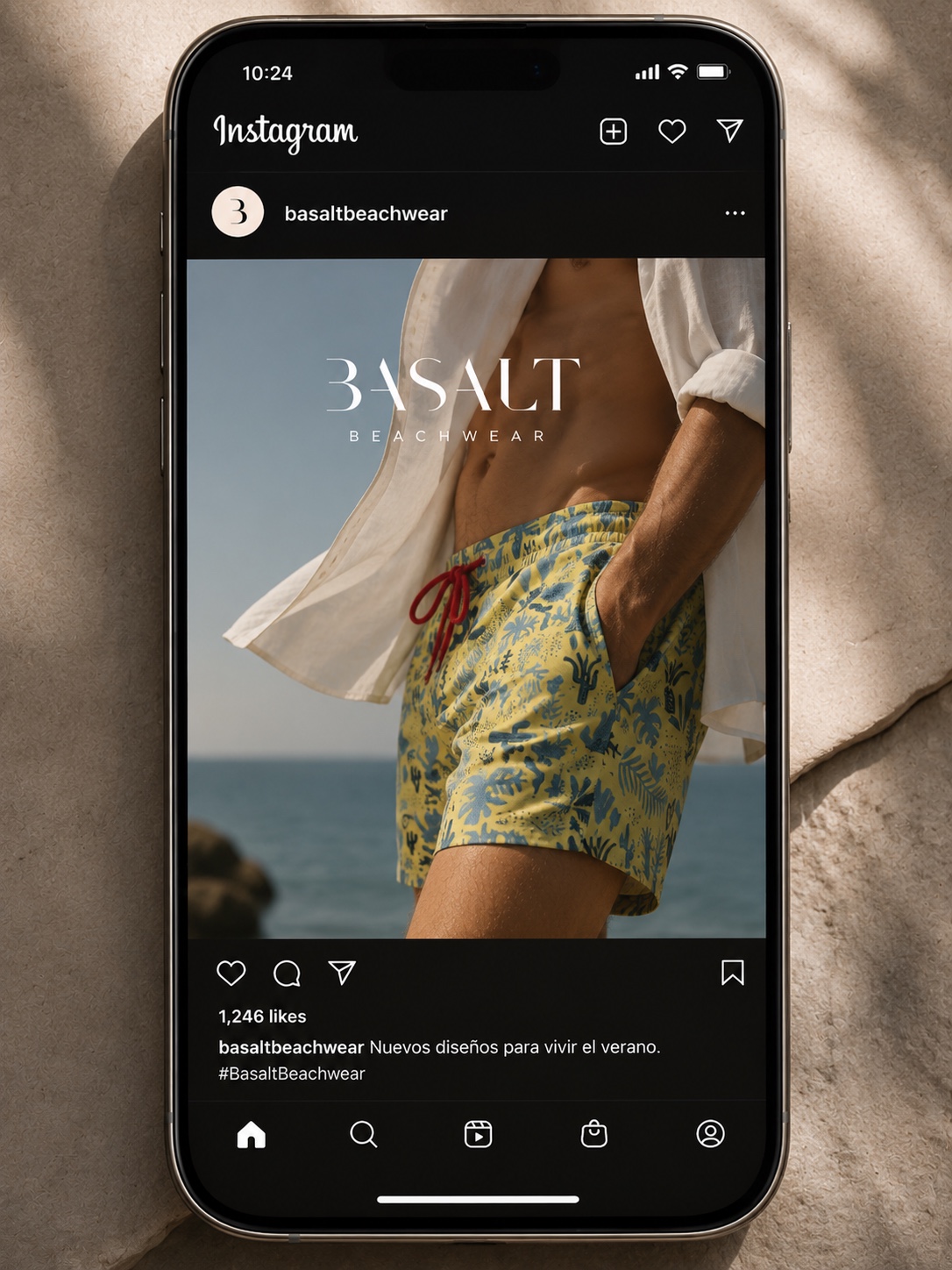
Basalt Beachwear needed a distinctive identity that could feel sophisticated in black and white, then shift into confident colour wherever the brand meets its customers. I designed the logo and built a flexible graphic language around its sculptural letterforms.
The system moves from the monogram and wordmark into shopping bags, garment tags, swimwear graphics, and digital and social applications. Restrained neutrals, tactile materials and selective colour accents give each touchpoint a recognizable Basalt signature while keeping the core identity elegant and fashion-led.
My roleDeveloped logo and communication assets across brochure and flyer layouts
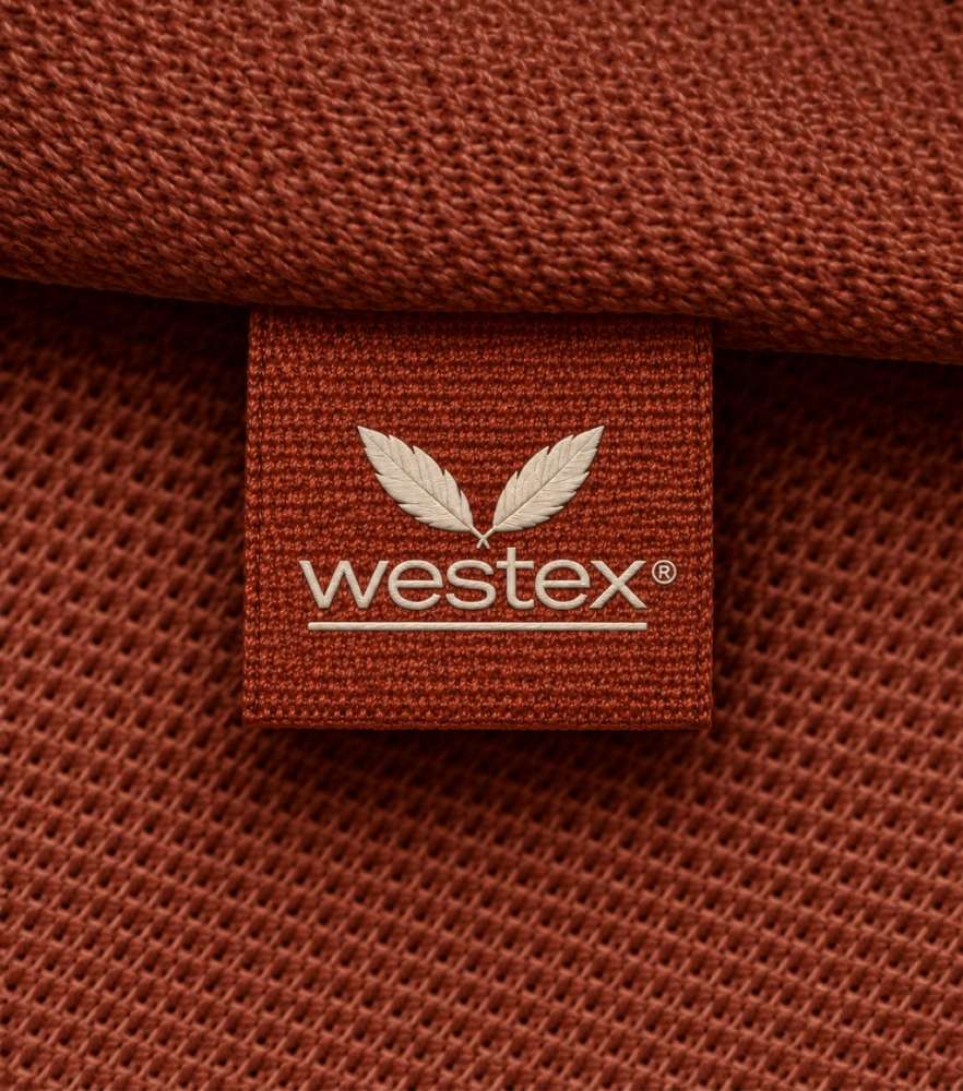
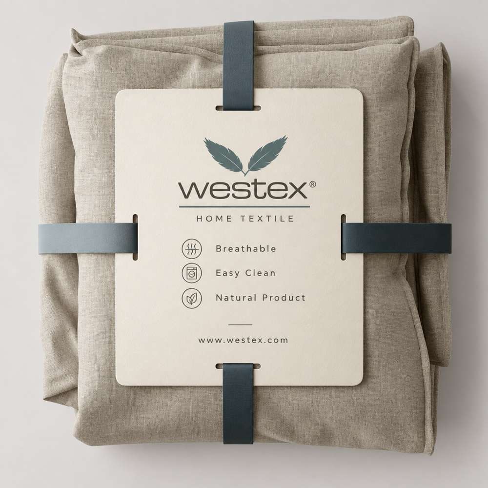
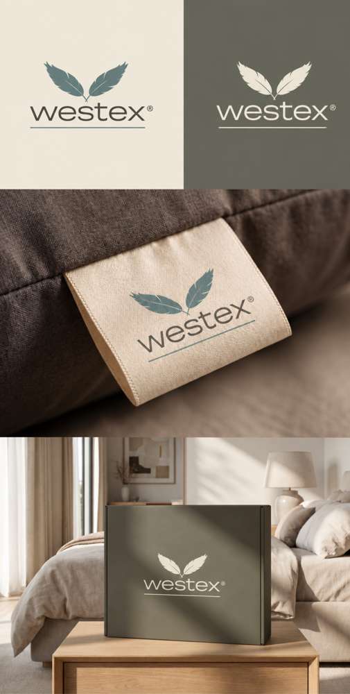
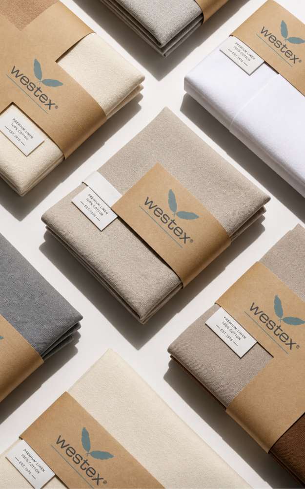
For Westex, the challenge was to make a material-rich offer feel as clear on the page as it does in the hand. I developed logo and communication assets across brochure and flyer layouts, using rhythm, hierarchy and tactile references to organize the story.
The resulting system gives textile character a disciplined frame—warm enough to communicate craft, structured enough to support repeated business use.
Multidisciplinary designer · Toronto
Foresight · Strategy & researchFive case studies in strategy, systems and futures — LEGO and the Bloom Cycle, newcomer research in Toronto, and the toys of 2040.
Strategy and foresight connect signals, people and possibility—turning complexity into clear directions for products, brands and future experiences.
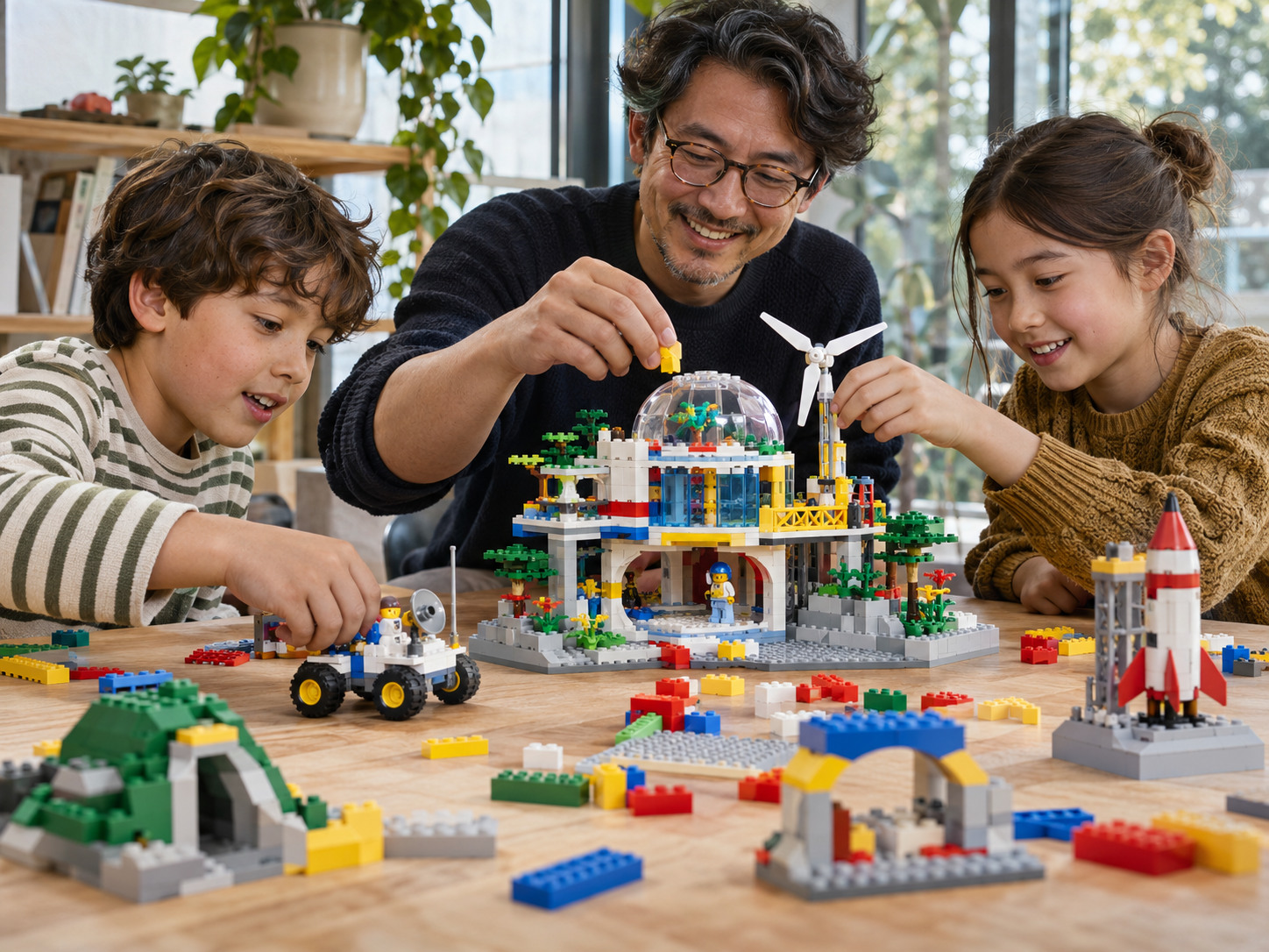
A future-facing strategy for how LEGO could strengthen its leadership through innovation and adaptability. The analysis explores products for aging populations, smart toys and connected services, and more sustainable materials and circular consumption models.
SWOT, PESTLE and value-chain analysis clarified LEGO’s position, strengths and the pressures shaping future play.
Foresight scanning surfaced signals across demographics, technology, sustainability and shifting patterns of consumption.
Triage prioritization and the KT Scan turned a broad signal set into focused strategic questions and opportunity areas.
An Ambition Matrix and timeline translated the strongest opportunities into a phased strategic direction.
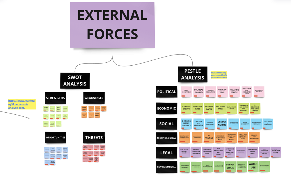
Vitality expands play toward aging populations and lifelong wellbeing. Nexus connects physical products with smart toys and services. Circularity advances eco-conscious materials and models that keep products and value in use for longer.
A study of the immigration, settlement and integration journeys of newcomer families in Toronto. Insights from seven semi-structured interviews and six co-creation sessions reveal the challenges, emotions and resilience involved in cultural adaptation, community connection and building a new life.
Auto-ethnography, literature review and netnography established context before primary research began.
Seven semi-structured interviews, diary studies and six co-creation sessions captured experiences across the journey.
Qualitative coding and affinity mapping organized many personal accounts without flattening their differences.
Card sorting helped test relationships between needs, emotions and moments where support could matter most.
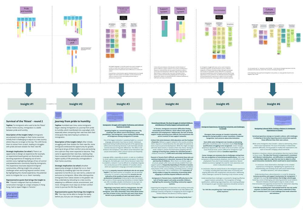
The process connects detailed personal stories with recurring emotional patterns, creating an empathetic frame for services, policy and community support across immigration, settlement and integration.

Prepared for the Canadian Centre for Food and Ecology, The Bloom Cycle turns a broad revenue challenge into a phased corporate-service strategy that can scale without losing sight of the charity’s “healthy food, healthy planet” mission.
Launched in 2024, the Canadian Centre for Food and Ecology is a registered charity reconnecting people with food, land and one another. The brief began as a revenue-generating corporate service offering and was reframed through research as a phased, scalable and mission-aligned growth strategy.
“Feeding the Future” sets out a modular path from digital infrastructure and co-created pilots to products, membership and national reach—giving the CCFE room to test, learn and invest with care.
The report was prepared by Green Carrot Studio: Sara Blanke, Carol Cheung, Brandon Meawasige, Paola Pieschacon and Zachary Scholtz. I contributed as part of this multidisciplinary team.
Stakeholder analysis, systems mapping, the Golden Circle and Viable System Model clarified how the organization creates and sustains value.
The Flourishing Business Canvas and Causal Layered Analysis expanded the view from immediate programs to deeper assumptions and long-term value.
STEEPV scanning and affinity mapping brought social, technological, economic, environmental, political and values-led shifts into a coherent opportunity set.
Three Horizons organized near-term initiatives, transition work and longer-range ambition into a practical roadmap.
Roadmap
Co-develop with AltGrocery across the website, media team, content strategy, app, online store and data—creating a foundation for engagement and revenue.
Test tailored services across Office Culture, Events and Education, supported by a donations-based model.
Launch curated food boxes and a CCFE membership program that help employees carry healthier, locally rooted choices into home life.
Scale a service portfolio through local implementation guides, staff growth, regional partnerships and donations to Indigenous communities.
The strategy begins with workplace experiences, then carries into employees’ homes through boxes, memberships and digital resources. As informed choices spread through personal networks and new regions, small moments of engagement become wider food-system change—building revenue while strengthening the CCFE’s role as a national connector for healthier food choices and a healthier planet.
Framing and sensing immigration in Toronto—from awareness to empathy. This analysis examines how power, institutional attention and reinforcing feedback loops shape immigration, settlement and integration for newcomer families.
How do institutional power, social experience and economic pathways interact to influence whether newcomer families can build stable, connected lives in Toronto?
Stakeholder mapping, causal interaction diagrams and system archetypes made relationships visible—from high-influence institutions to the feedback loops felt by individuals.
The work distinguishes economic and socio-cultural integration pathways, revealing where policy, employers and community support can respond with greater attention and empathy.
Stakeholder mapping showed that employers and IRCC hold high influence while individual attention and empathy can remain low.
Causal diagrams linked underemployment with underappreciation, discrimination and lower-income brackets.
System archetypes surfaced a desire-and-ability loop around immigration goals and the different routes through economic and socio-cultural integration.
An “eroding goals” frame connected large-scale newcomer growth with integration struggle, declining mental health and onward migration.
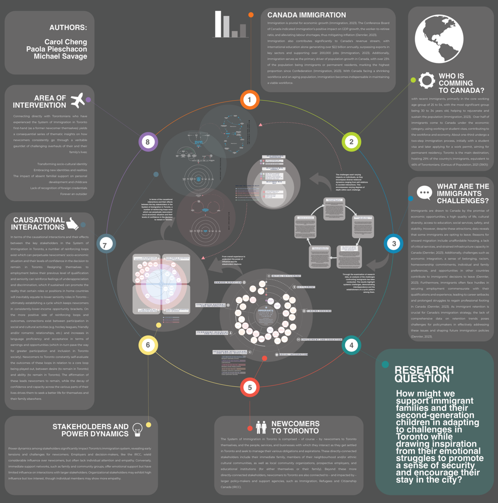
The analysis reframes integration as a set of connected conditions rather than an individual task. It identifies leverage points where influential institutions can pair economic opportunity with attention to belonging, dignity and mental wellbeing.
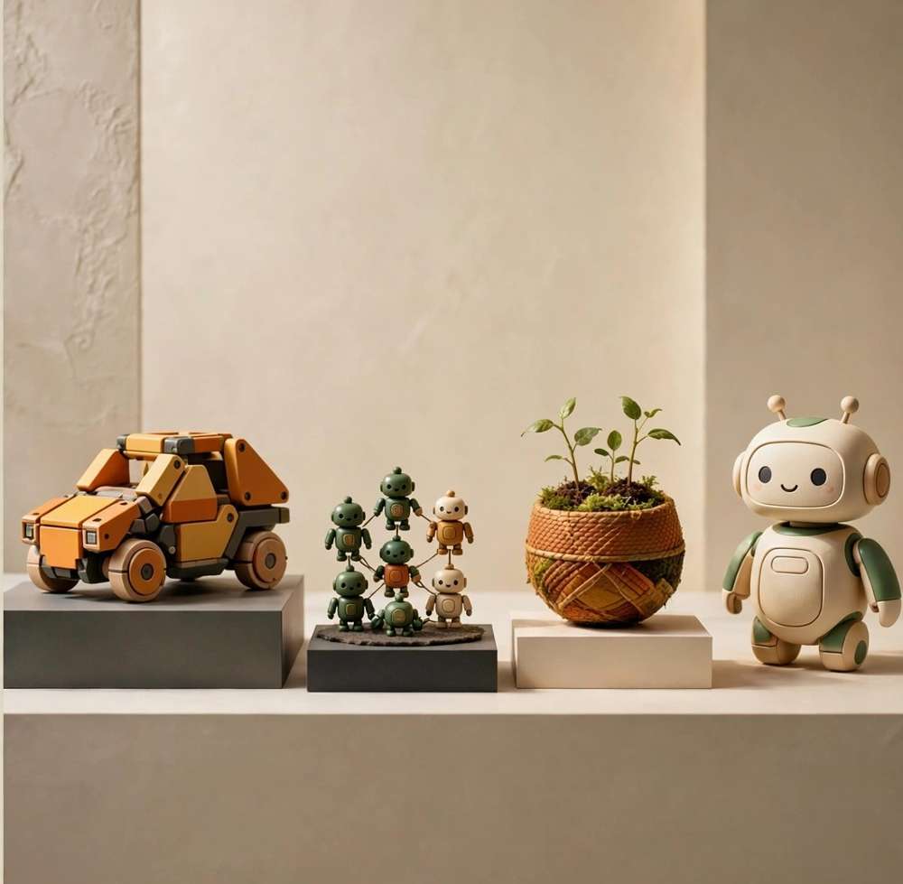
A scenario-planning project that asks how toys might evolve where digitization and consumption meet. Four futures make shifts in technology, sustainability, access and lifelong play tangible enough to discuss and act on.
How could toys change by 2040 as connected technology, consumption habits, sustainability expectations and who play is for all evolve?
Trend and driver analysis informed a two-by-two matrix built around digitization and consumption, creating four distinct but plausible worlds. My foresight workflow is now AI-assisted at the signal stage: AI helps process trend signals and draft scenario sketches, which I validate and develop through workshop judgment.
The scenarios test lifelong companionship, immersive and AI-enabled play, sustainable low-tech creativity, ethical design and the risks of unequal digital access.
Signals covered IoT, AI and immersive play; sustainability demand; overconsumption versus mindful consumption; aging populations; and the digital divide.
Digitization and consumption formed the two axes, stretching the future into four contrasting, decision-useful scenarios.
Merch Mania, Connected Collectibles, Crafted Play and Grow with Me each reveal different benefits, tensions and design responsibilities.
A museum-style exhibition used CARBI, NanoBits, Sproutables and aMIca as artifacts from each imagined future.
The scenarios position toys as potential lifelong companions while keeping ethical concerns visible. Together, they offer a practical way to navigate technology and consumption without losing creativity, connection or access.
I’m a multidisciplinary designer with over 10 years of experience — I make ideas tangible, and help teams move through complexity with clarity.
My work moves between spaces, objects, brands and future-facing strategy. I use that range to connect how something looks, how it works, what it communicates and how people feel around it.
I begin with curiosity and care: listening closely before deciding what a project should become.
Across more than a decade of practice — beauty packaging for Belcorp’s strategic brands, furniture collections, interiors and digital services — my foundation in industrial design brings rigor to form, ergonomics, materials and production. Interior styling adds atmosphere and spatial experience. Research, service design and foresight extend that thinking toward behaviour, systems and the choices that shape what comes next.
I completed a Master of Design in Strategic Foresight & Innovation at OCAD University in Toronto, extending a practice grounded in making into deeper systems and futures work — and bringing that strategic range back to every product, space and brand I design.
AI-assisted scenario development in my foresight work, and AI-assisted data collection in the X-Matik LaneCruise project. Where AI is used, it supports the groundwork; I own the analysis, the judgment and the final design.
My education moves from the craft and systems of industrial design into strategic foresight, human-centered innovation and future-ready brand thinking.
OCAD University, Toronto · GPA 4.0/4.0 · Focused on complex problem solving, human-centered innovation and future-proofing brand strategy.
Universidad Javeriana · GPA 4.4/5.0 · Ranked 6th of 85 students.
Further training: Design Thinking workshop (2014), Open Innovation workshop (2014), and Photoshop/Illustrator CS6 certification through an Adobe Authorized Training Center (2013).
I start by understanding the people, context and ambition behind the brief. Research and observation clarify the opportunity; sketches, layouts, models and prototypes make options visible; testing and collaboration strengthen the final direction. In my foresight work, AI tools help process signals and draft scenario sketches; on X-Matik LaneCruise, AI assisted the data collection — while the analysis, judgment, selection and final decisions remain mine.
The goal is not decoration for its own sake. It is work that feels considered now, useful in practice and relevant for what comes next.
From spaces with heart to strategies with a horizon.
Open a pathway to see the kind of work and projects inside it.
Kvell, Nido, Acento and Luna—four distinct projects shaped through ergonomics, material studies, modelling, sourcing and production intent.
Medical dry-herb vaporizers and X-Matik LaneCruise developed around usability, clarity and trust in advanced technology.
Fascina and eight further beauty programs grounded in deep consumer research — interviews, focus groups and insight analysis — then concept design, three-dimensional development and production feasibility.
Future-facing growth directions and innovation strategy shaped from market shifts, system context and emerging opportunities.
Research, service design and digital experience projects that translate complex journeys into clear, useful interventions.
Two downtown Toronto building lobbies styled through furniture, material finishes and lighting to elevate arrival and support a stronger leasing presence.
Eight guest-ready rental units with a cohesive warm-minimal direction, styled unit by unit for comfort, character and photography.
Two units prepared for sale through decluttering, strategic furniture and lighting placement, and styling for listings and showings.
Logo and website design for the premium rental brand, carried into signage, stationery and the guest experience.
Identity, packaging, retail signage and e-commerce experience built around sculptural letterforms.
Textile identity and communication across labels, packaging, and print production.
Let’s make something considered, useful and memorable.
For roles, collaborations or a closer look at any project in this portfolio, write to me.
[email protected]Toronto, Canada